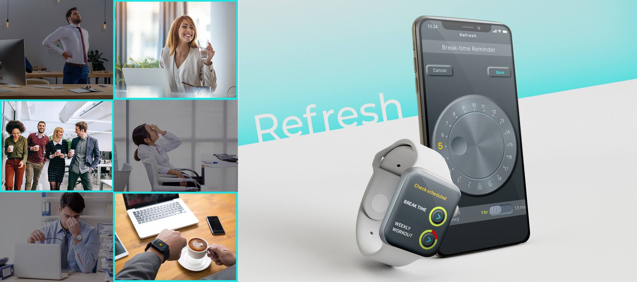
Refresh
An iOS-based mobile and apple watch app that notifies users of break times throughout office hours as well as weekly fitness reminders.
Project background
People are spending more time on computers, whether at work or at home. This has led to several health complications ranging from extreme eye fatigue to severe backaches. These issues stem from improper posture, insufficient breaks, and lack of exercise.

Scope of the App
Aims to promote measures that reduce the negative consequences of extended working hours. A reminder on the watch face fulfils certain goals, such as:
- 'Break' notification at predetermined intervals to alleviate eye and muscular fatigue.
- Hydration reminders.
- A workout plan based on the amount of time spent sitting
Drawbacks of working without breaks:
Possibility of developing neck and back issues
- Dr Subhash Jangid, Director and Unit Head, Fortis Bone And Joint Institute (India), says, “Staying in one position for a prolonged period of time can result in spine issues. If you don’t take a break between work, the muscles of the back which are anti-gravity muscles will get fatigued which will lead to pain and stiffness.”
Feeling fatigued all the time
- By working long hours without breaks, one denies their body and mind the opportunity to rest, resulting in acute exhaustion and major physical and mental health issues in the long run.
Getting psychologically attached to work
- Lack of breaks may cause a person to get mentally tied to their job, which is detrimental to their health and well-being. Psychological separation from professional life is crucial because it helps individuals to unplug from work and allow their brain and body to rest.
Difficulty making decisions
- Numerous studies have shown that making decisions becomes very challenging when the mind and body are not sufficiently rested. In fact, taking a pause in between long work hours boosts productivity, attentiveness, memory retention, and creativity.
Straining eyes
- Being hooked to a computer screen for longer durations may cause eye strain. Computer vision syndrome (CVS) is a condition that occurs when the eye is concentrated on the screen for extended periods of time. Headaches, blurred vision, neck pain, fatigue, eye strain, dry eyes, irritated eyes and double vision are some of the symptoms of CVS.
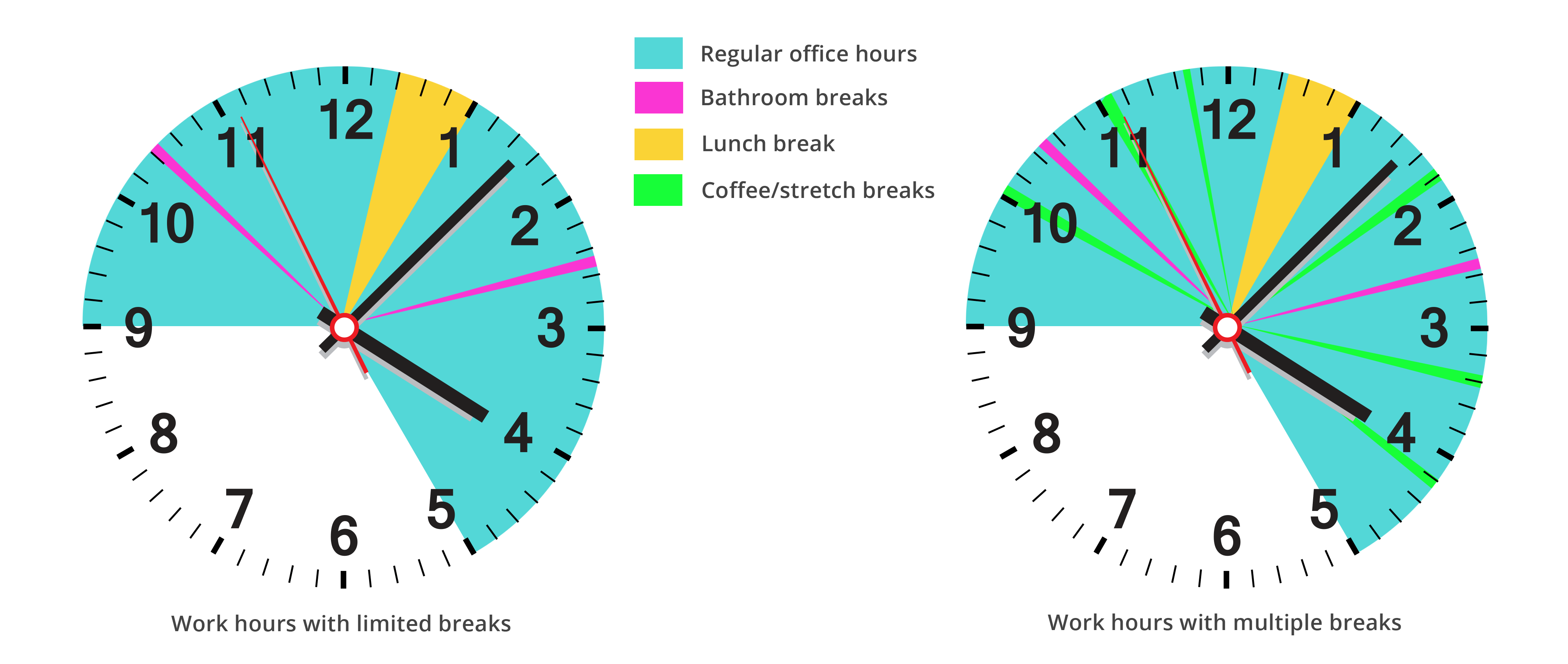
Making small changes in daily routine
Taking brief breaks is critical for sustaining good health and a consistent performance throughout office hours, as evidenced by the data above. If somebody intends to establish the habit of taking these micro breaks on a regular basis throughout their work hours, they must do it systematically and on a consistent basis. They will also be expected to start a weekly fitness plan to counteract the negative effects of prolonged sitting.
Modifying the working hours with small break intervals
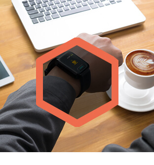
The Apple Watch App
Using the Apple Watch's built-in pedometer (function to track steps), one might create an app that alerts the user when to take a break from work. The app may also be customised to deliver various warnings in a timely way, based on what the user chooses to do during a certain break period. It might be hydration reminders, coffee, or even a stroll around the office.
The iPhone App
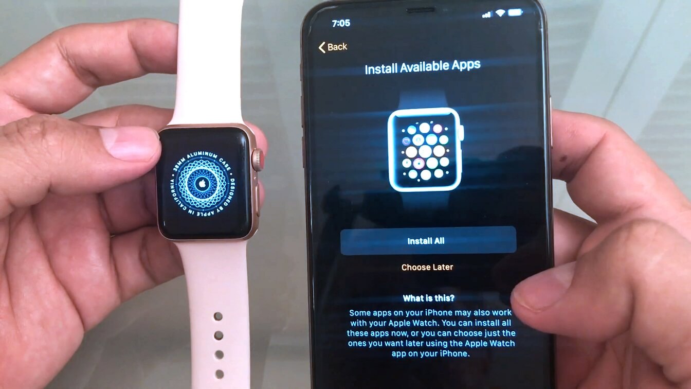
Due to the apple watch's restricted UI space, changes to settings and other inputs are made through a companion phone app. The apple watch connects with the associated iPhone using Wi-Fi, Bluetooth or cellular network. This procedure optimises the user experience of the watch app. Both the watch and phone applications are installed concurrently when they are downloaded from Apple's App Store.
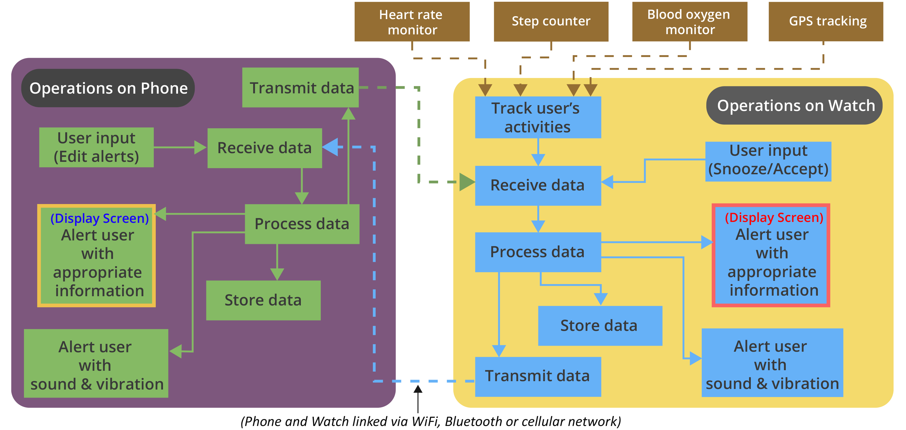
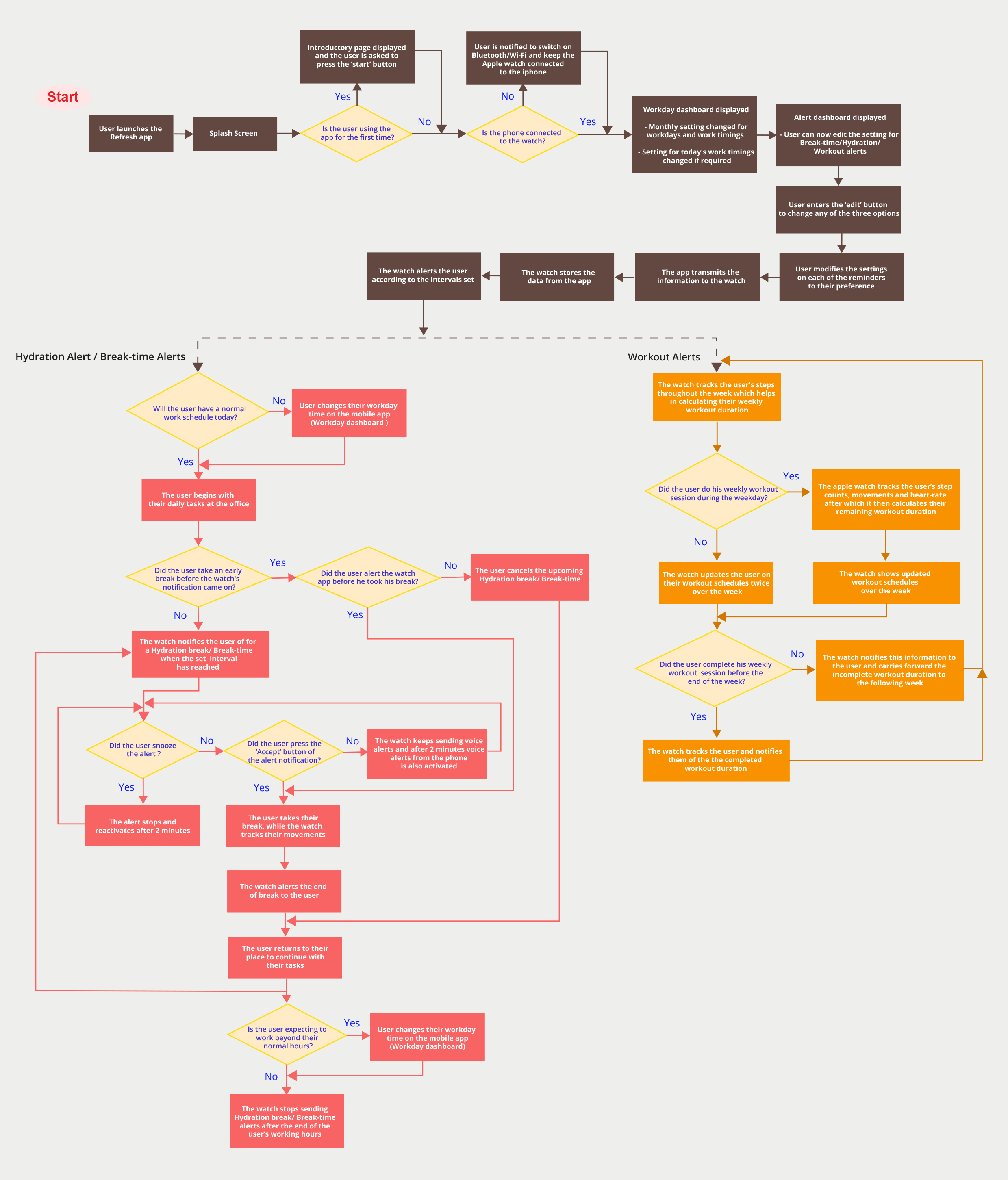
Data Communication Flow
When the user makes an input on the watch, it sends data to the phone and vice versa; in fact, there is a sequence of communications between them at various points throughout their operation. The flow of communication between these two devices is shown in the figure.
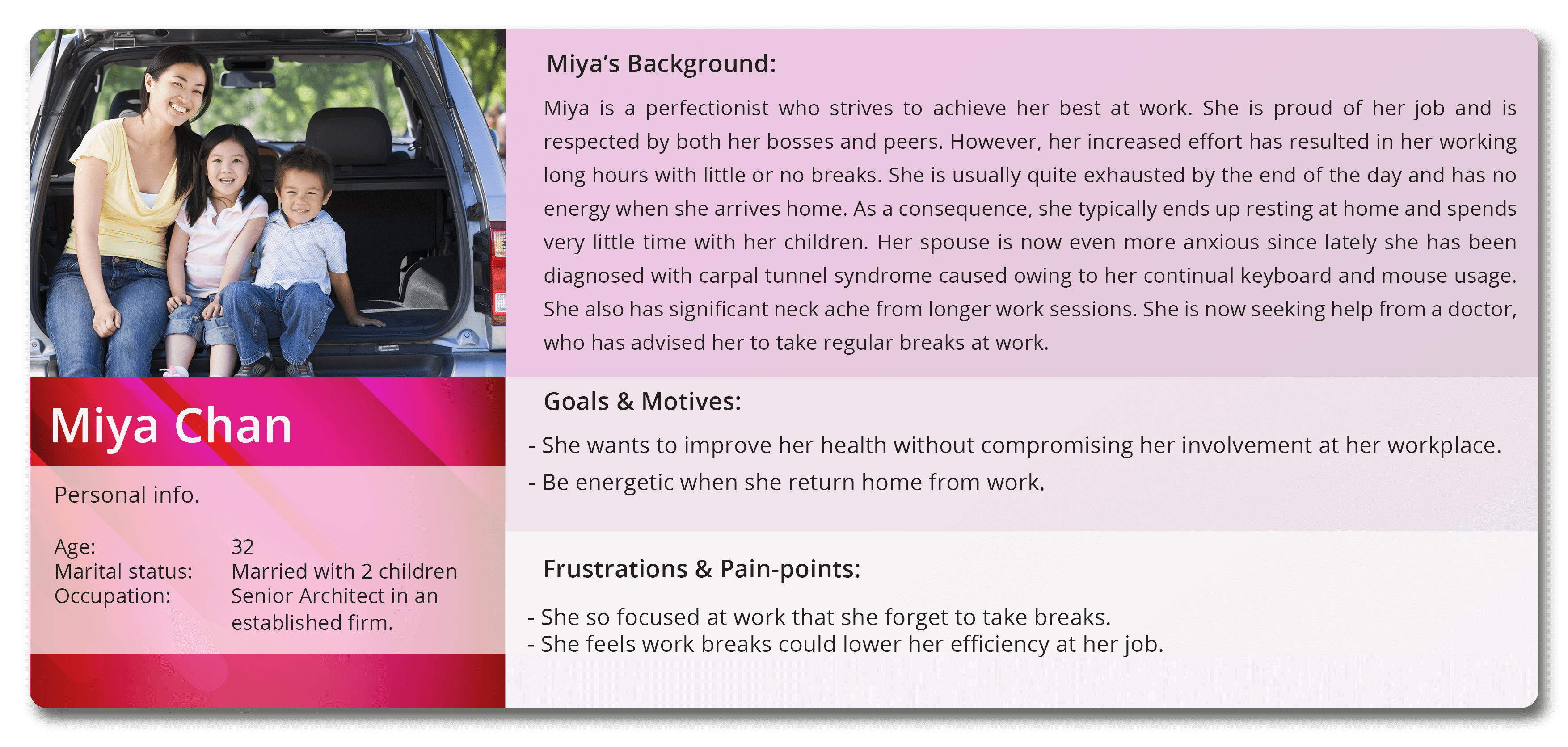
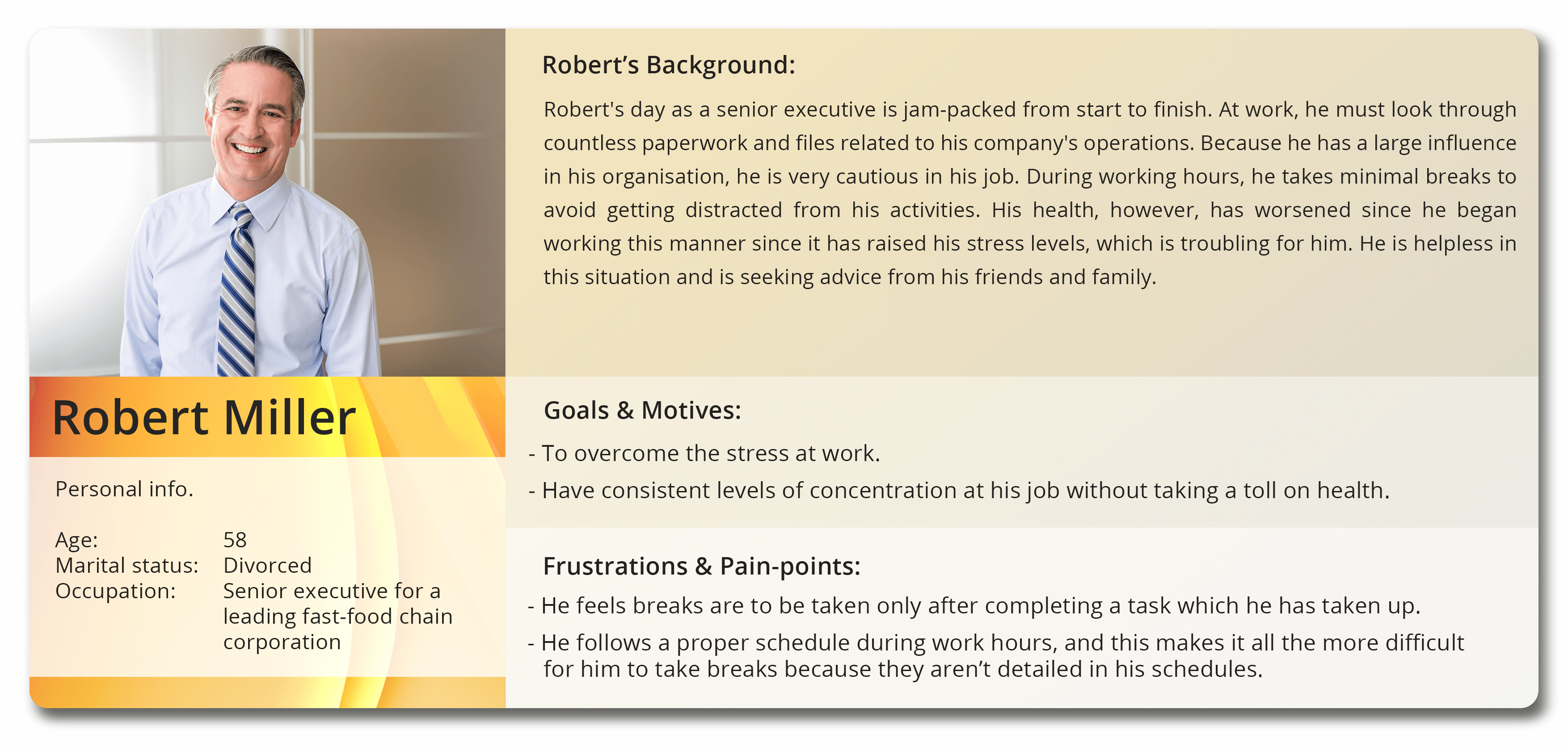
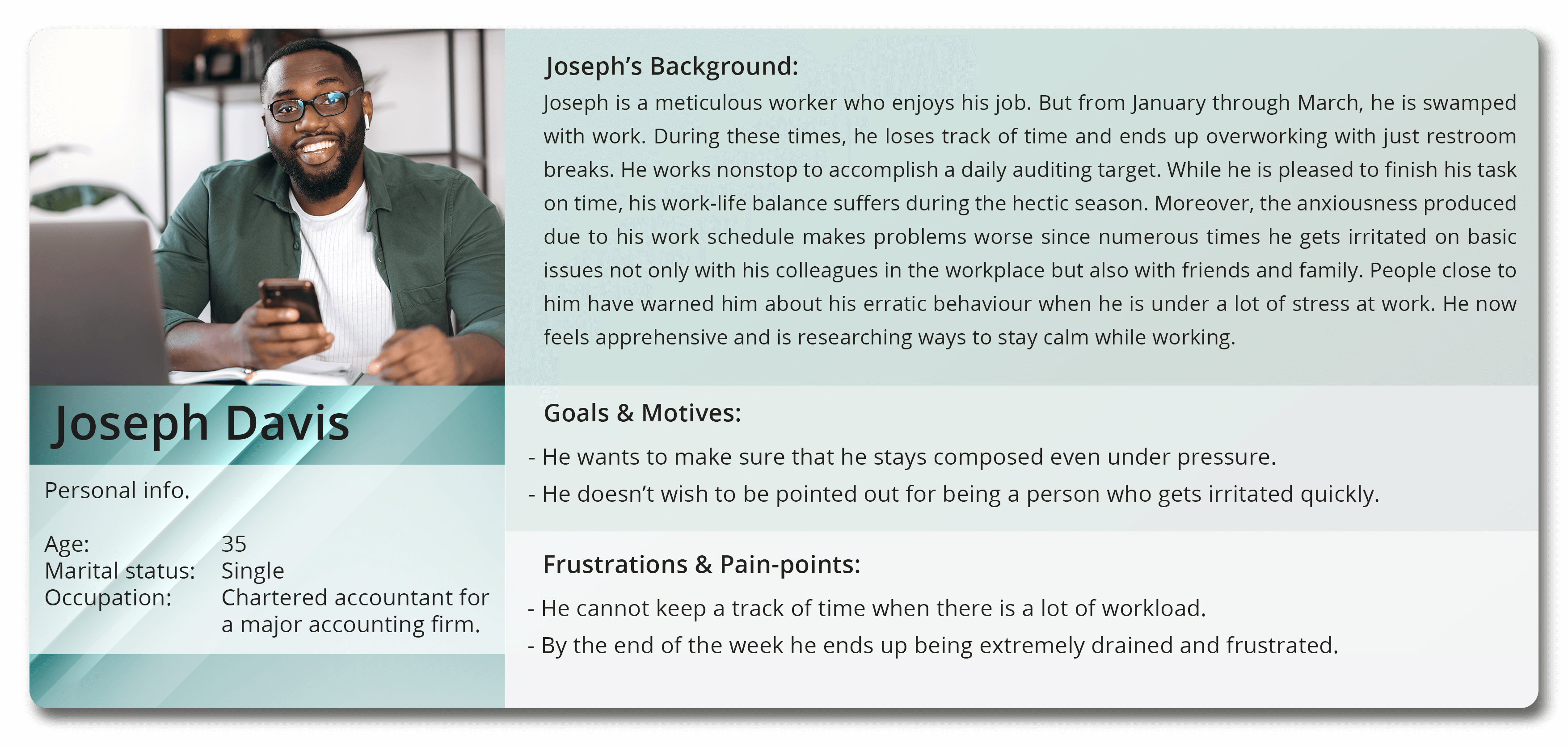
User personas
Identifying the requirements of the key stakeholders of the application from three user personas
A strong direction
The user personas provided a better understanding of the intended user experience for both the mobile and watch applications. It also set expectations for the app's UI style and theme.
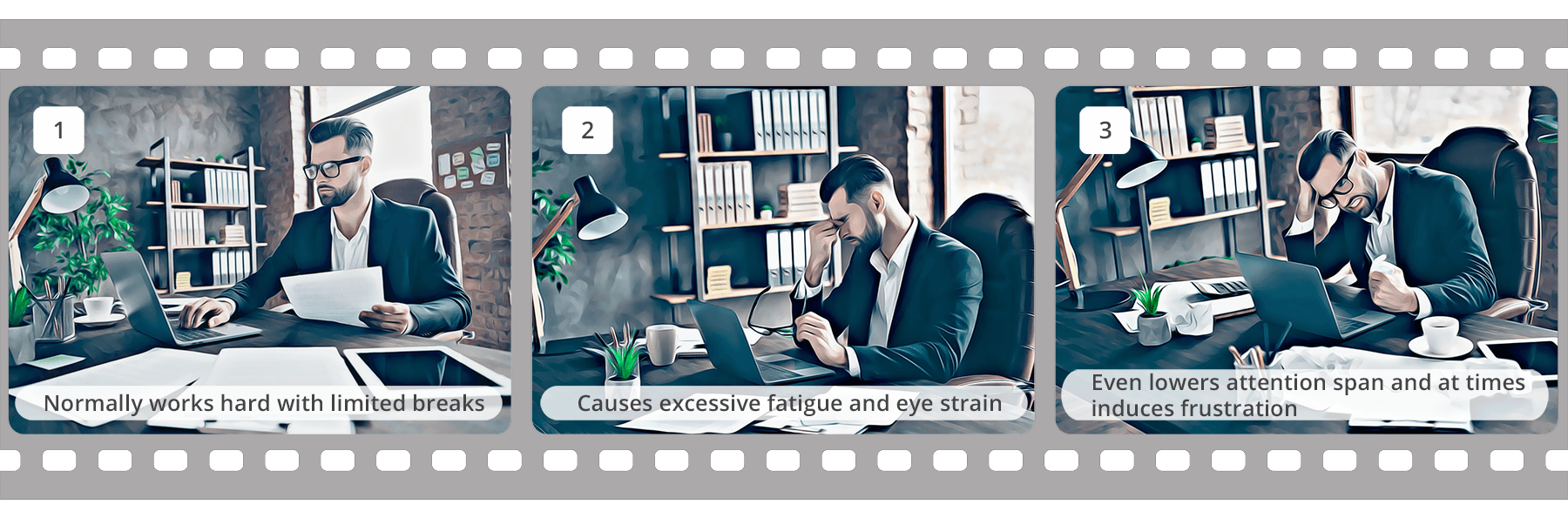
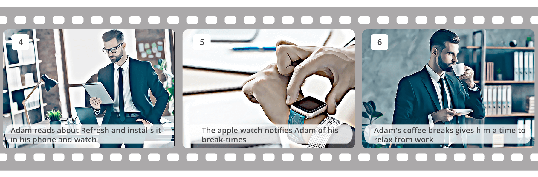
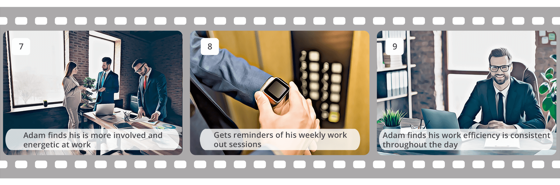
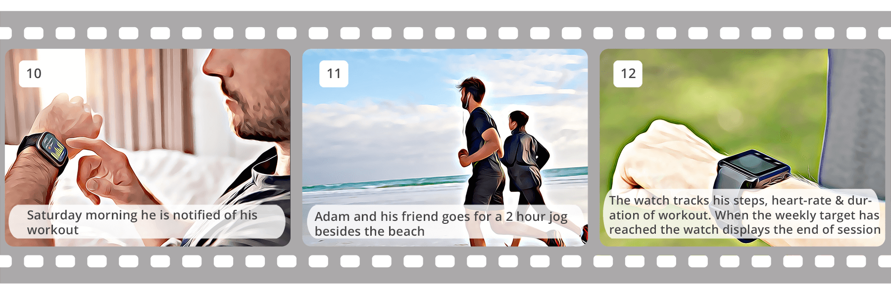
Storyboarding the use case scenario
An ideal environment was built to visualise the usage of the 'Refresh' app after analysing the project's background, suggested solution, and user personas.The following storyboard served as a visual narrative that illustrated the potential use case scenario and outlined the path for a strong user flow.
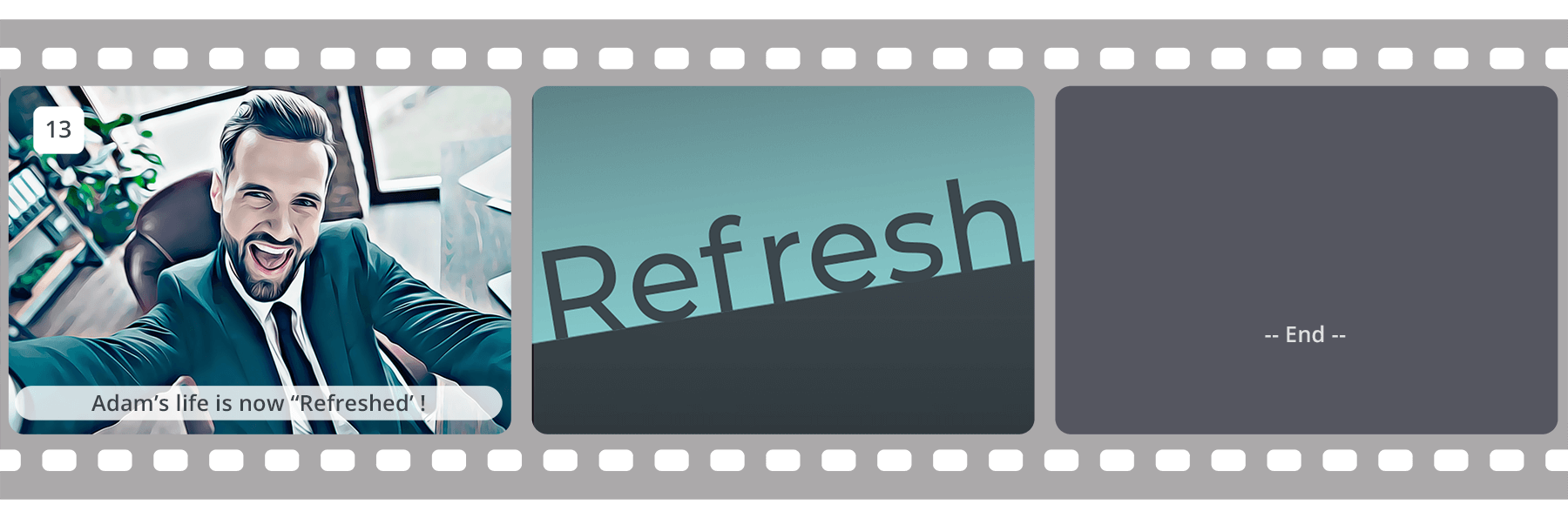
The storyboard features Adam, an investment banker. He is a career-oriented individual who is highly focused at work. He also spends much of his time in front of a computer, which has dramatically reduced his quality of life. The following slides explain how the ‘Refresh' app helped Adam live a healthy life.
User-flow
The user flow provides a macro perspective of the operations occurring on the watch or smartphone UI. What is shown below is a result of several refinements, which aims to enhance the user experience.
Low fidelity
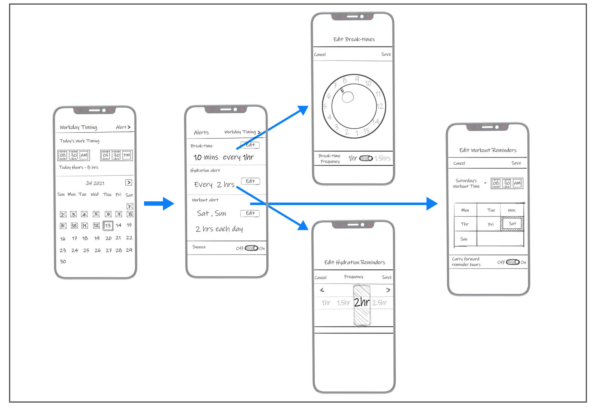
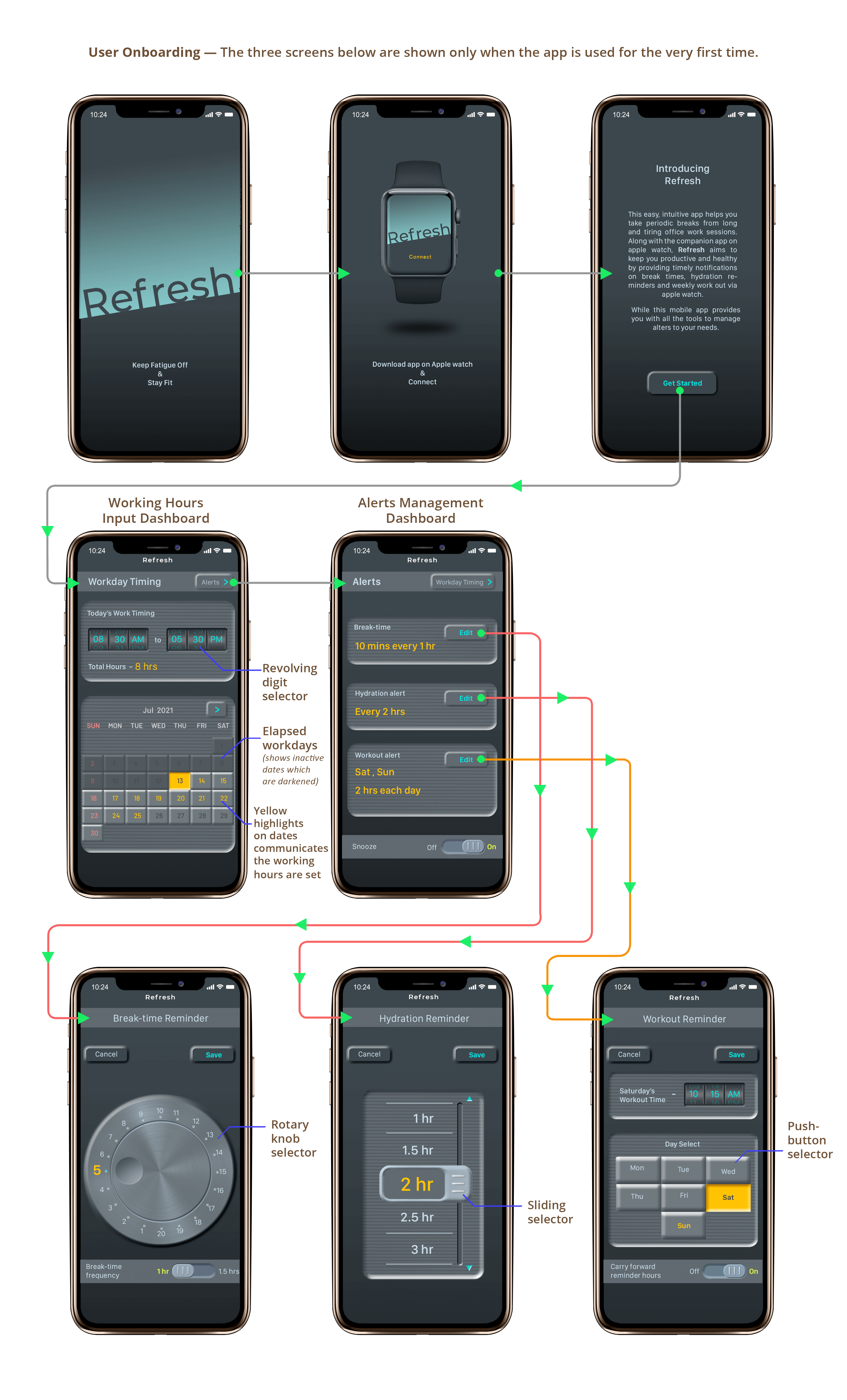
Mobile App Wireframes
The virtual haptic feel necessary for UI components was a primary emphasis for the mobile app's interface design. After testing with numerous UI concepts, these wireframes were finalised.
Low fidelity
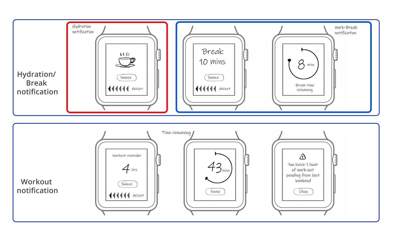
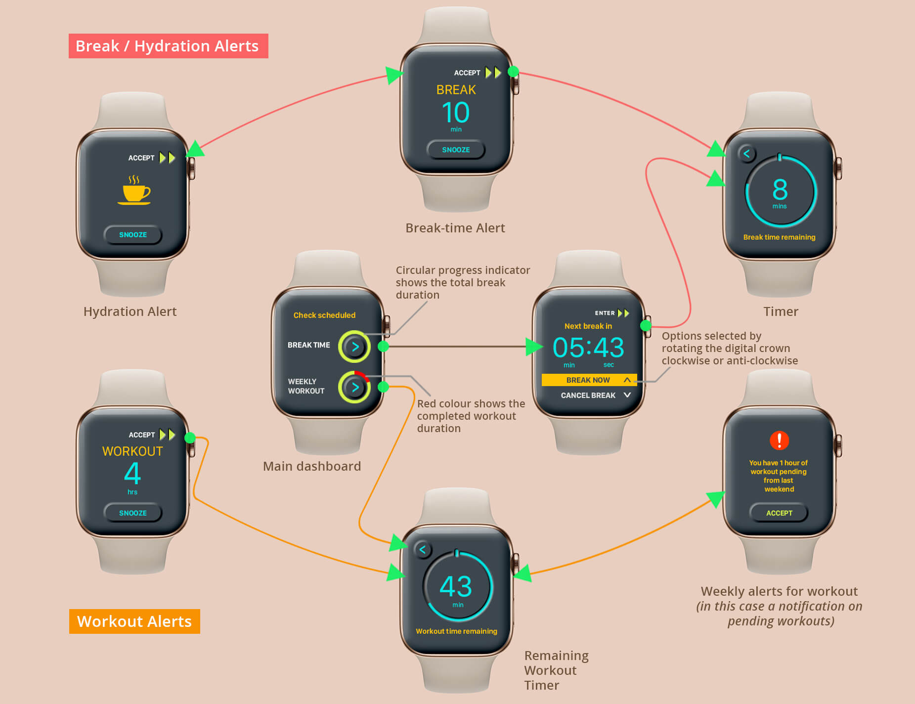
Watch app Wireframes
The low-fidelity watch wireframes served as an early prototype for the first round of user testing. These UI panels were drawn onto a 1:1 scale paper cut-out of an Apple watch and user tested to evaluate the experience of the app. It was discovered during user testing that the swipe-buttons for ‘accept' and ‘snooze' toggle were just so nearby that triggering the unexpected function was frequent. As the prototype matured, the ‘accept’ process was relocated from the touch screen to the physical push button of the watch’s digital crown.
Creating the App's identity
The main goal of ‘Refresh' is to instil a feeling of obedience in its users, which means every aspect of its UI should be sophisticated enough to change the way the device is perceived. UI components with Neumorphic design were extensively utilised in the watch and mobile applications to achieve this aesthetic. Neumorphism mimics real-life objects. It adds a physical aspect to the flat UI paradigm, bringing it to life. To achieve this, it combines background colours, shapes, gradients, highlights, and shadows. This provides for a soft, extruded plastic appearance and 3D design.
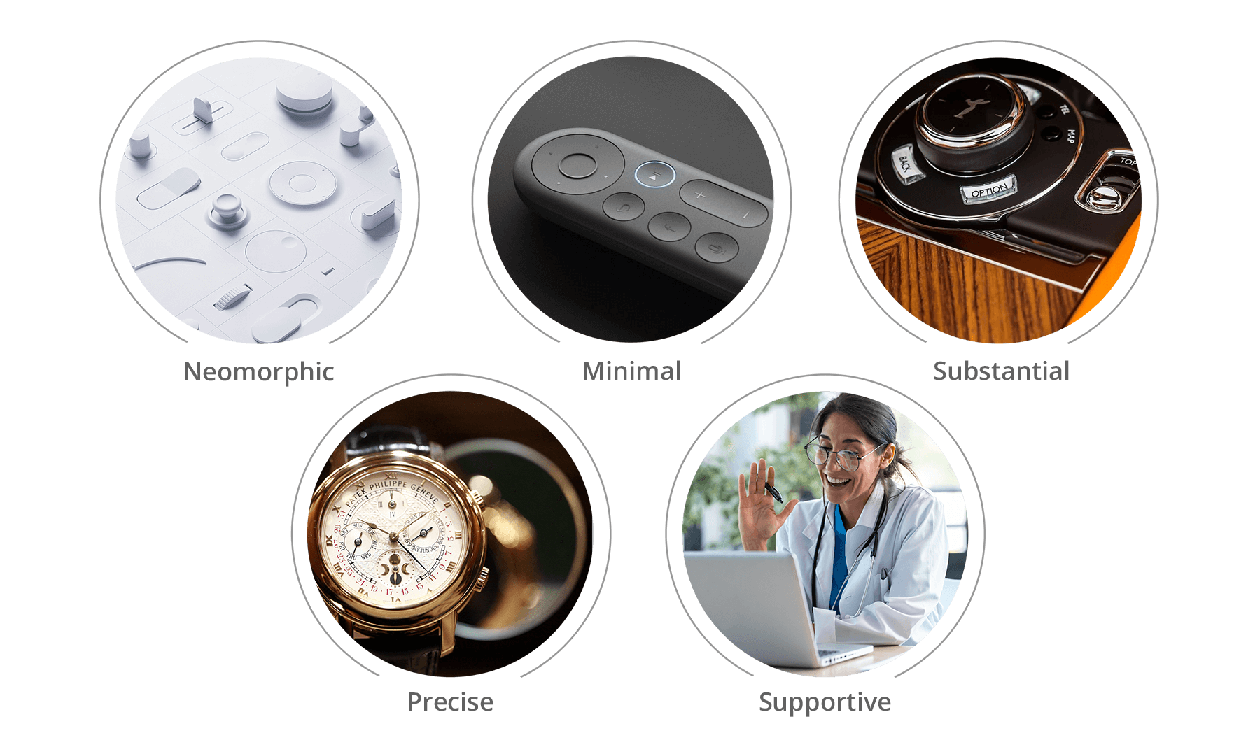
Keywords that defines the UI design
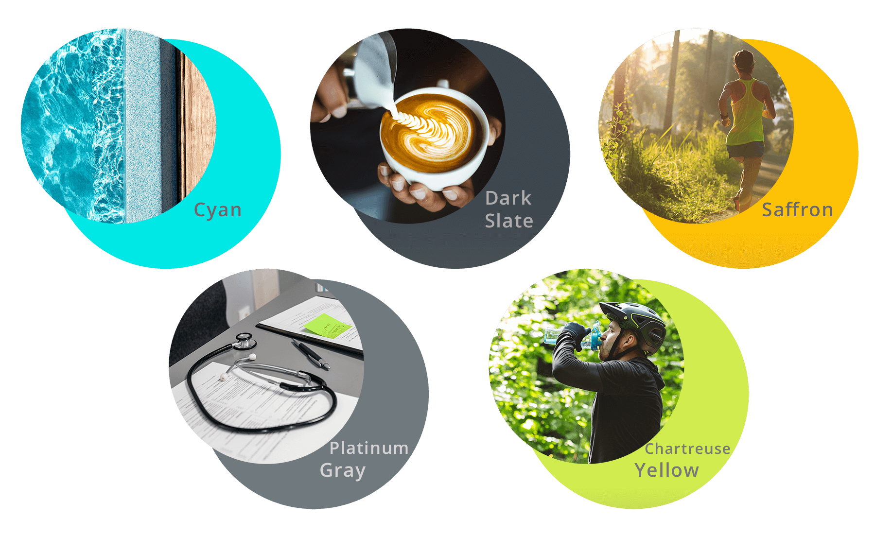
Colour palette
High fidelity
Mobile App UI
High fidelity
Watch App UI
Watch Usage
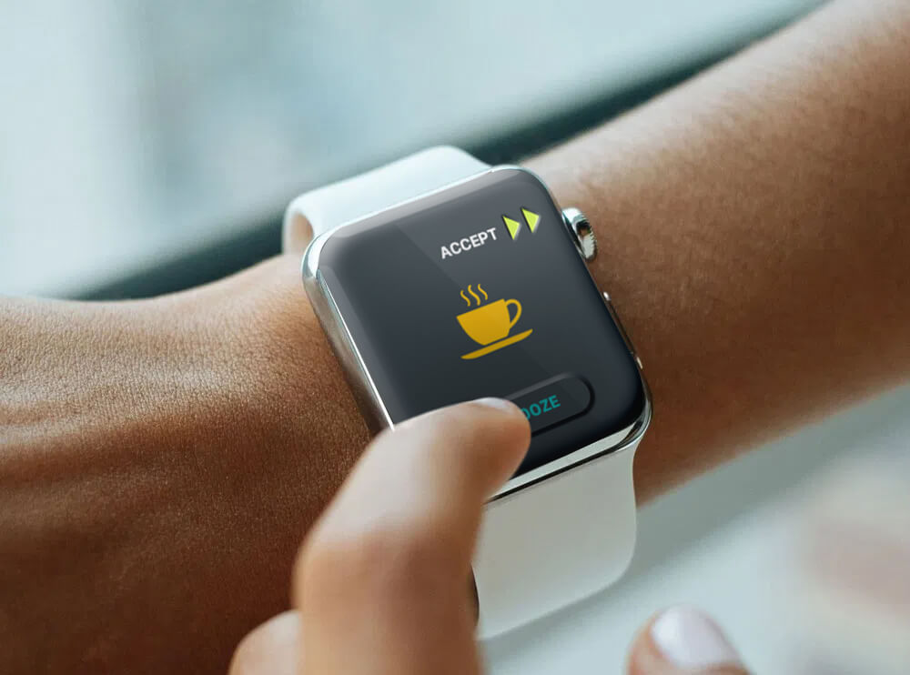
The function of the'snooze' button is adapted from that of an alarm clock; it is utilised here to delay the beak-interval. It's a button on the UI screen for convenience.
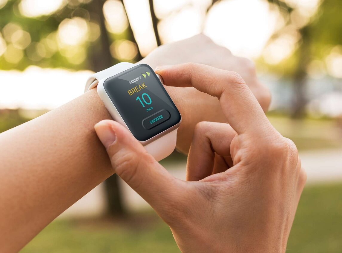
The 'accept' button initiates the break-interval, and when tapped, it begins the break-timer. To make it more tactile, it is assigned to a physical switch (crown).