Music On The Go
An in-vehicle music application which is designed to run on Tesla-Model 3’s infotainment system. The application is designed from ground up to minimize driver distraction.
A link to the working prototype of this app is attached towards the end of this report !
Project background
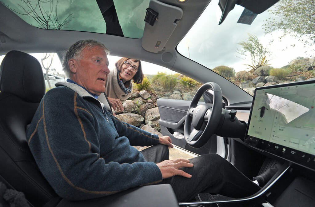
Tesla Model 3's horizontal 15-inch touchscreen infotainment controls many car features. The left quadrant of this screen (for left-hand drive automobiles) displays and controls critical vehicle functions including headlights and wipers. The remaining 75 percent of the screen is used to display applications like navigation maps, music players, and so forth. The music application designed for this automobile has some significant UX issues; this project focuses on resolving these concerns.
The Problem
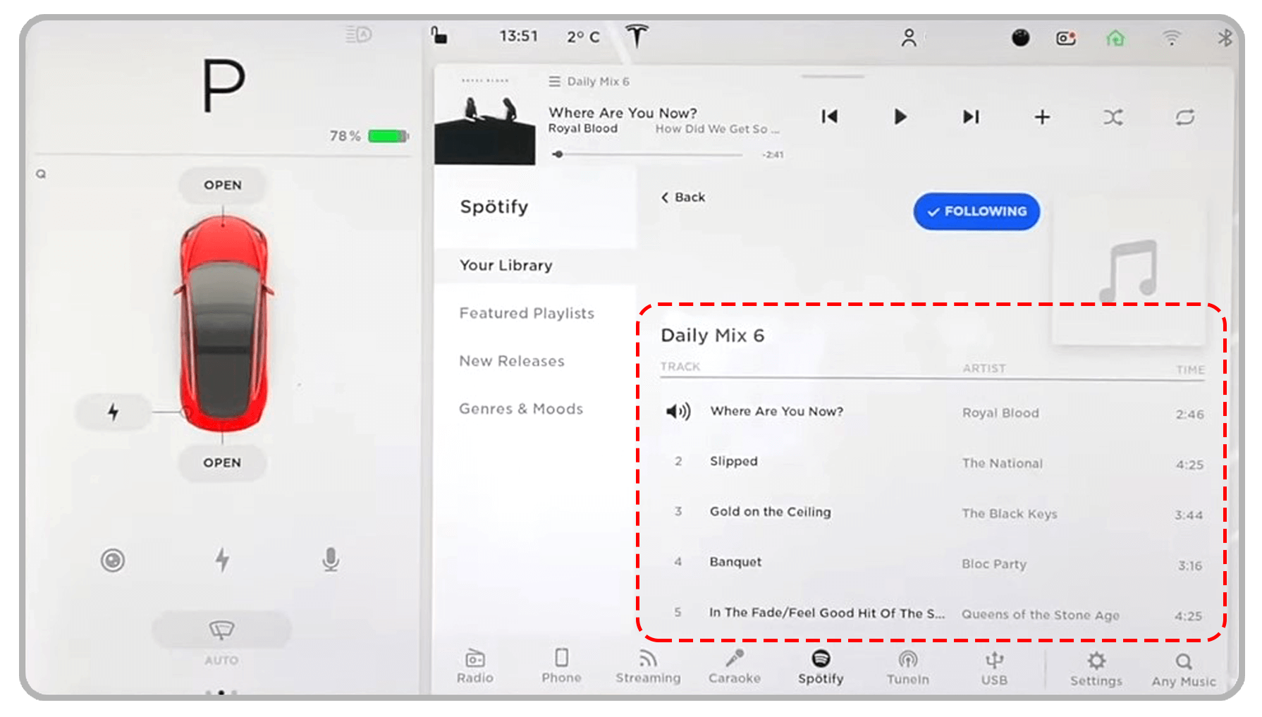
The music app isn't optimised for usage in vehicles, and most of its features are found in conventional web apps that operate on a personal computer or a tablet. In fact, drivers find this app annoying since it diverts their focus from driving.
Focus of the problem
Following information points to the issues in the existing music app:
(1) Scattered layout
Different sections of the application are unevenly placed or do not have any methodical arrangement.
(2) Text heavy
The information about different songs and artists are text heavy which would require the driver to spend more time reading while searching for a music track.
(3) Cluttered
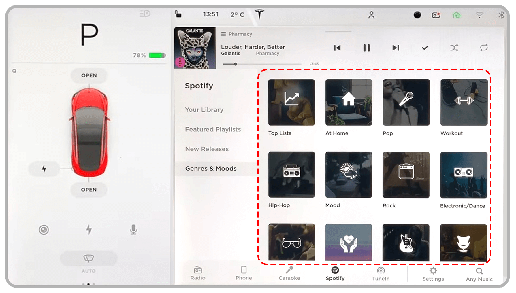
The album-art / music-genera icons are closely packed to each other which requires more concentration from the driver while they make a selection.
(4) Unergonomic control placements
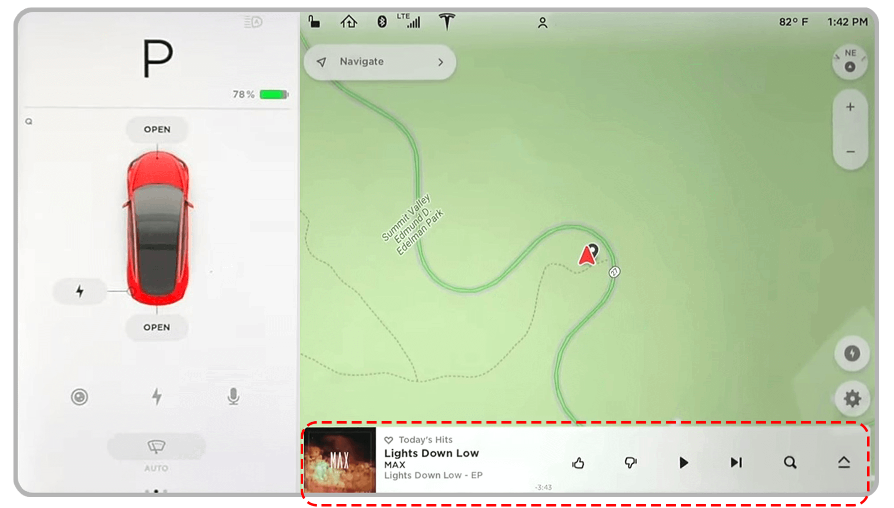
Vital music playback icons are visually smaller and they are placed at a distance from driver’s reach.
User Interviews
Four Tesla model-3 owners of different age groups and backgrounds were interviewed to gain their valuable insights on the usage of their vehicles’ music app.
Sania Saeed Age: 29, Profession: Project manager Model-3 user since 8 months
Pain points of using the Music app
- Because I am short heighted I have to stretch myself to reach all the way to the far end of the display.
- Even though the touch screen is highly responsive, I think it's necessary to have hard buttons for many vital functions like volume control and track selection.
- It is quite hard to know if I 'liked' a song, whenever I tap on the like button.
- The app cannot be customized to my preference.
- Searching a song by typing through the touch-screen keyboard is as dangerous as texting on a mobile phone while driving.

Zack Chan Age: 34, Profession: Software Programmer Model-3 user since 3 years
Pain points of using the Music app
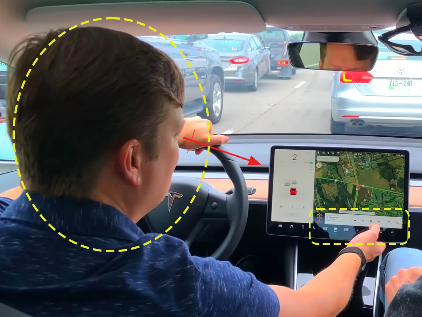
- The music app is way out of my line of sight while driving, which makes me completely take my eyes off the road to check tracks that are playing.
- It is not easy to read at a glance because information of the tracks that are playing are not highlighted on the full-size player.
- There is no much customization options for the player.
- I find it hard to shuffle through different playlists while driving, especially during rush hour traffic.
- The audio tuning functions are normally hidden in a sub-menu and for accessing that I must often select the audio-setting menu.
Wilbur Fraser Age: 71, Profession: Retired Civil Engineer Model-3 user since 4 months
Pain points of using the Music app
- There is so much information displayed on the music player that I find it hard to select any specific item while I drive.
- The player control icons are a bit small for me to clearly see especially when I am driving; so very frequently I tap the wrong controls.
- I feel the music app isn’t very intuitive especially in comparison with the uncomplicated climate controls.
- I find it difficult to have two different personalised playlist options set in the music app, because when my wife drives she wants to see the playlist of her choice.

Joseph Rodrìguez Age: 57, Profession: Bank Manager Model-3 user since 1 year and 8 months
Pain points of using the Music app
- I get distracted using the music app while driving, even though its layout is similar to that of any other streaming music app.
- Many options like selecting a music genre, a certain playlist and so on are scattered over different submenus which is not easy to use while driving.
- I have to look way below to view the music player when the navigation is active.
- The equalizer setting can only be viewed in a different panel and it’s a hassle to change it for different tracks I listen to.
Core principles behind the App’s redesign
Secondary research — Infotainment displays by other manufactures
Driver oriented dashboards
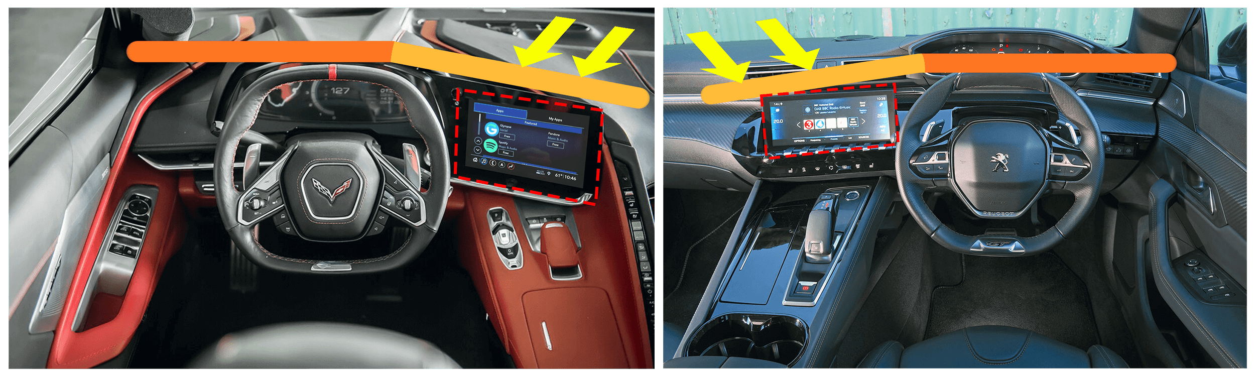
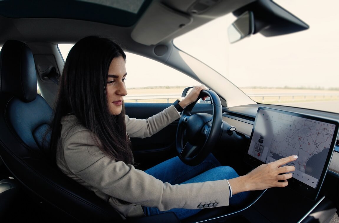
When display screens take over duties formerly performed by physical buttons, one of the better solutions devised by car manufacturers is to position the screen towards the driver. This improves accessibility.
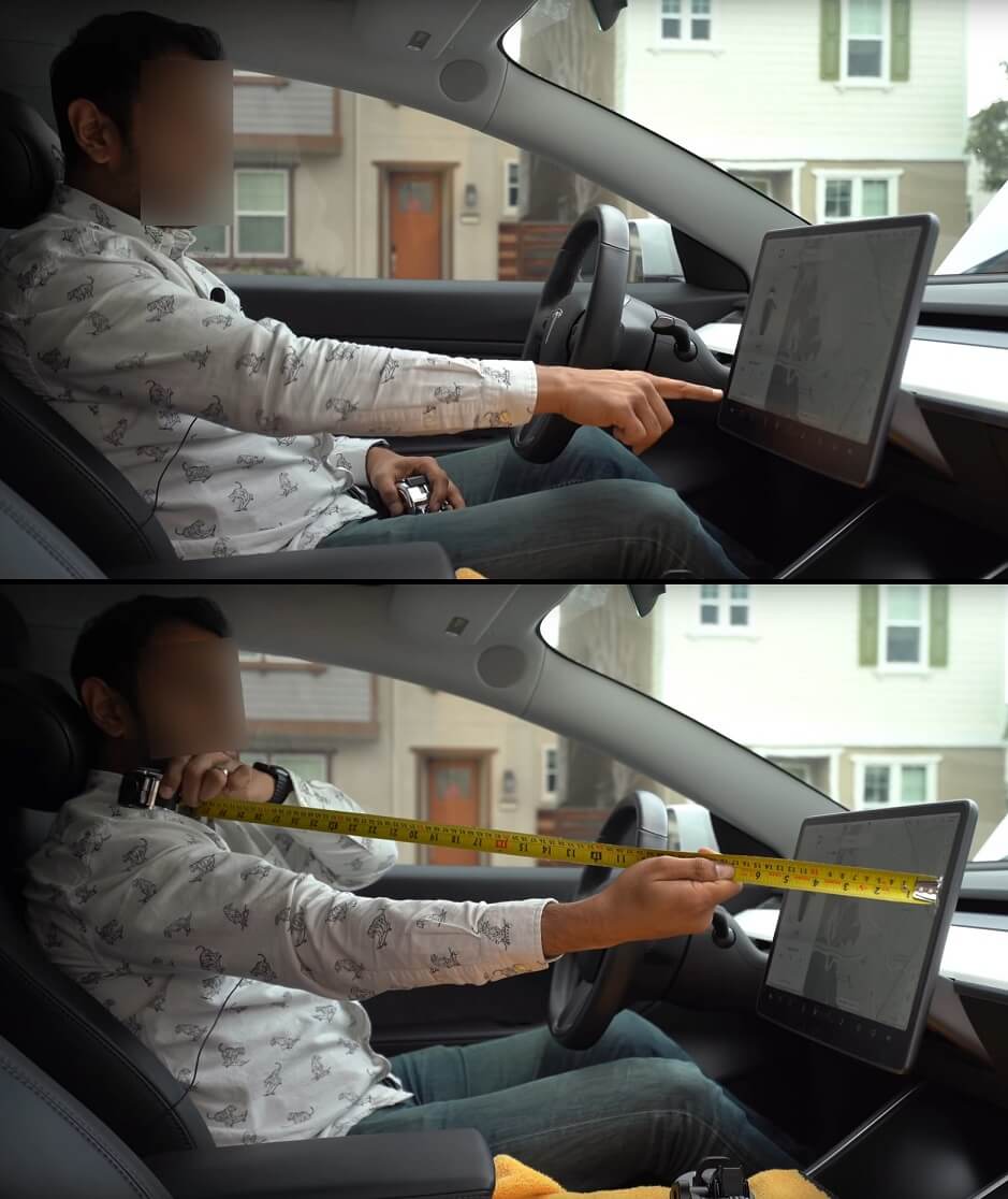
Designing around the ergonomics of app usage
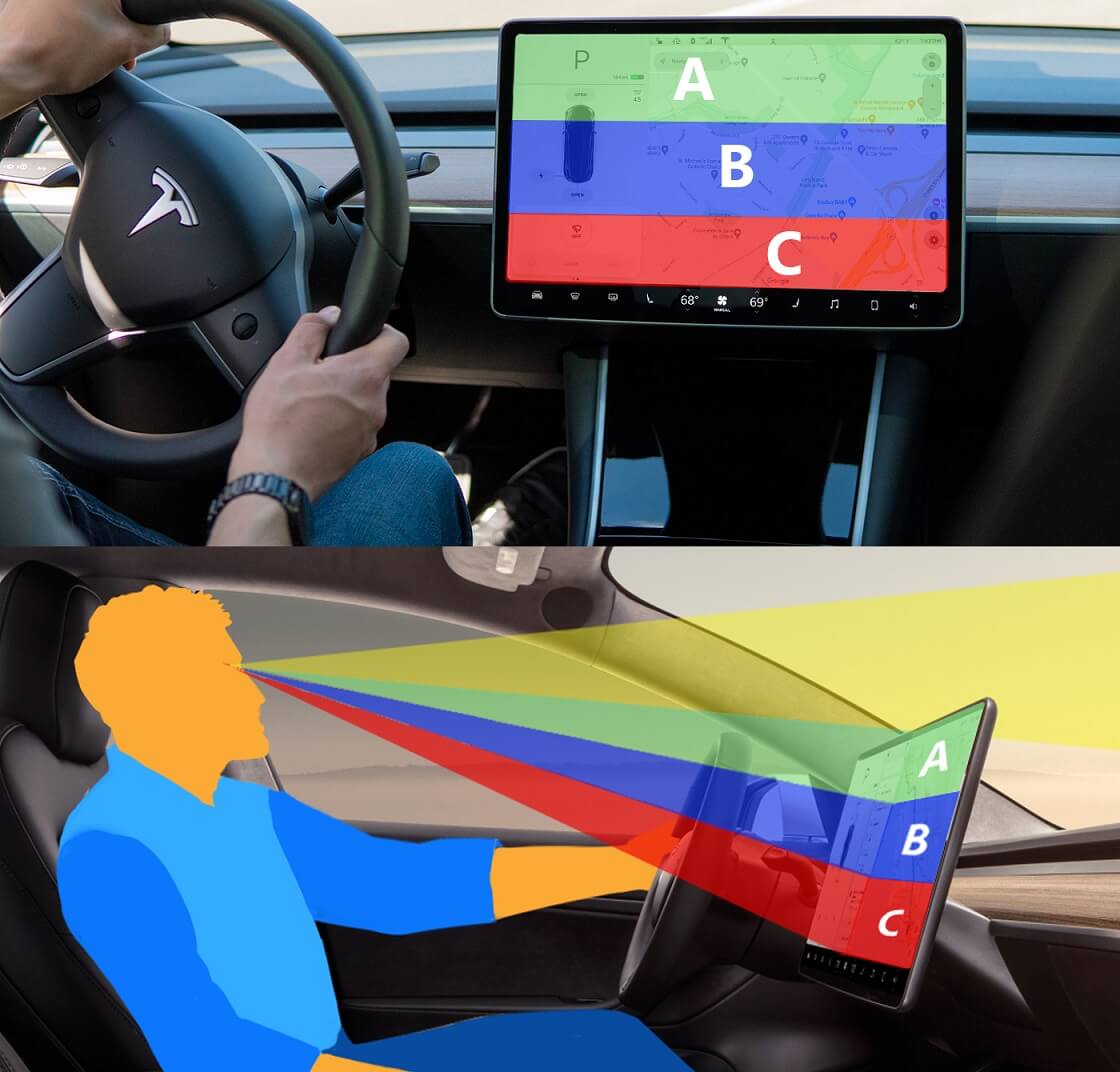
To understand the ergonomics, the screen's accessibility is measured for people of various heights. The reach of a 60th percentile male is taken into account in this scenario. The distance from the shoulder to the three display screen zones is determined. Here, 790mm is noted as the measurement to the furthest end. Similar measurements were made with individuals from the 20th to the 80th percentile.
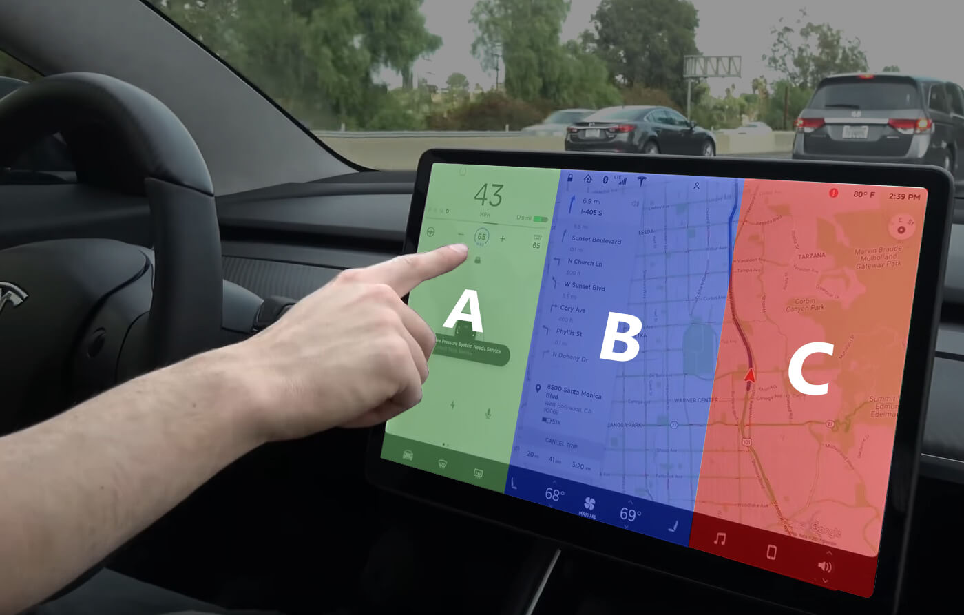
Dividing the display screen to 3 zones
The infotainment screen is assigned a score ranging from 'A' to 'C' based on the accessibility measurements obtained from various drivers, with 'A' being the easiest to reach and 'C' being the most difficult.
Dividing the display screen by line of sight
The division of the display screen into three zones is continued here to interpret the visibility of each section of the screen. While the previous way of separation was carried out in a vertical direction, this approach is carried out in a horizontal manner by extending the sight lines of drivers with minimal head tilting. The procedure was done on participants from the 20th to the 80th percentile.
Design & Development
Colour palette
The app uses two colour themes, Foggy morning (bright theme) and Starry sky (dark theme), which correspond to the time of day. Regardless of their different colour palettes, both themes are intended to be relatable. This is accomplished by utilising neutral colours on the lighter palette and without altering the colours on key components like the play, next track, volume control, and so forth.
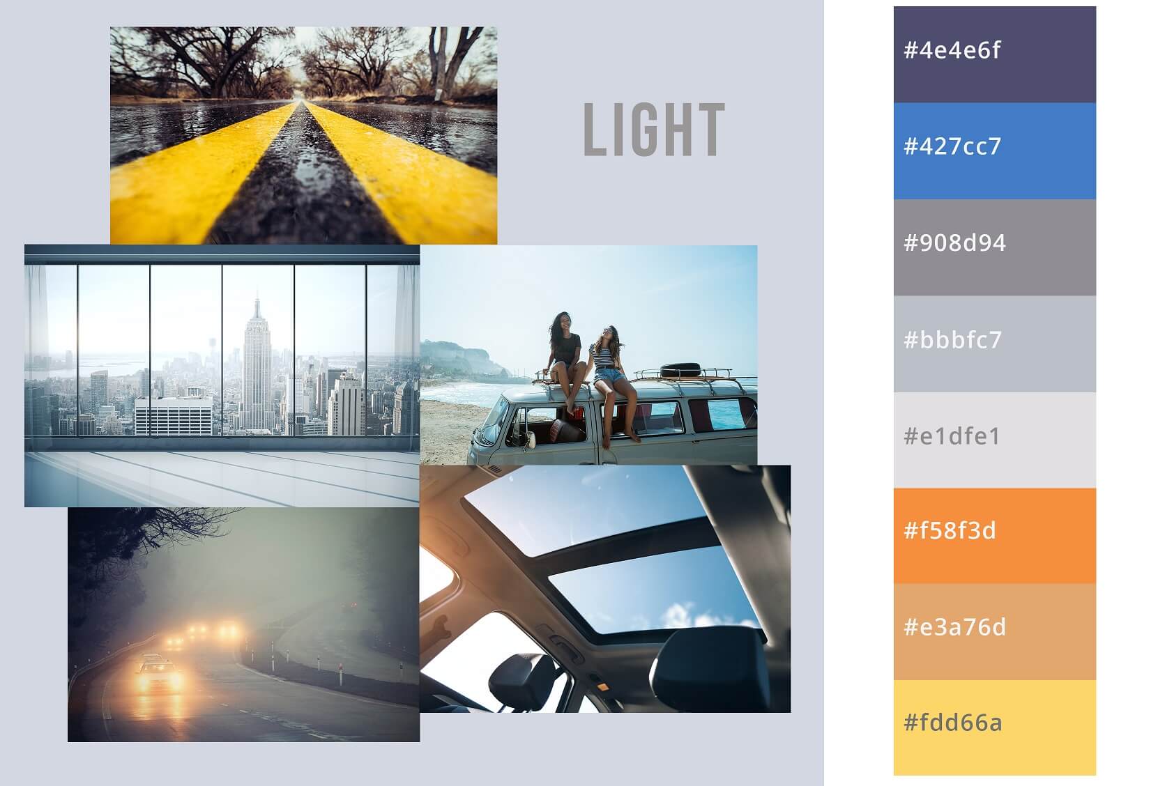
Light theme
Foggy Morning
This theme is basically a derivative of the colours that has been used in Tesla Model-3's day mode UI. The grey tint chosen as the UI's base tone is heavily inspired by the colour of the sky on a foggy morning.
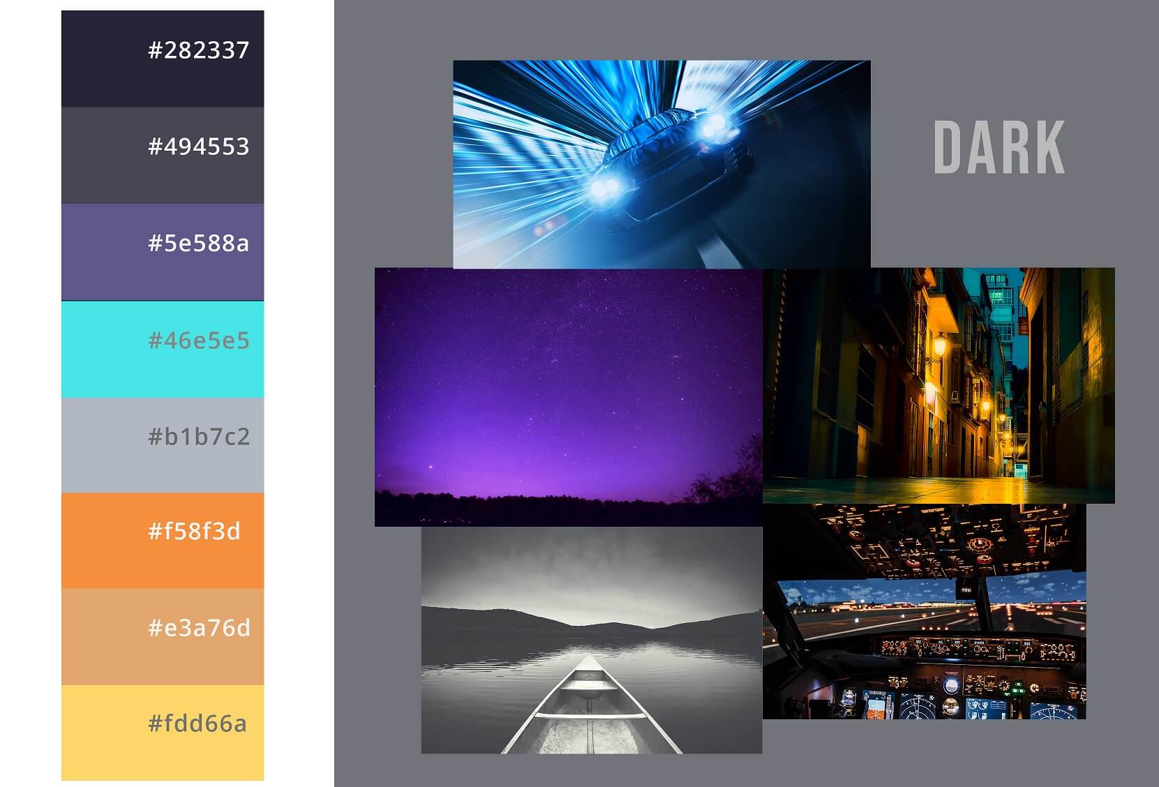
Dark theme
Starry Sky
The basic colours in this palette were inspired by the purple hue observed around twilight, providing a literal contrast to the light theme. The darkest shades of purple ensured that it blended well into the dark mode of Tesla’s UI. The effects of gradation are consistent between the dark and light themes. While the shades of yellow used for texts were inspired from the glows of street lights and aircraft instrumentation.
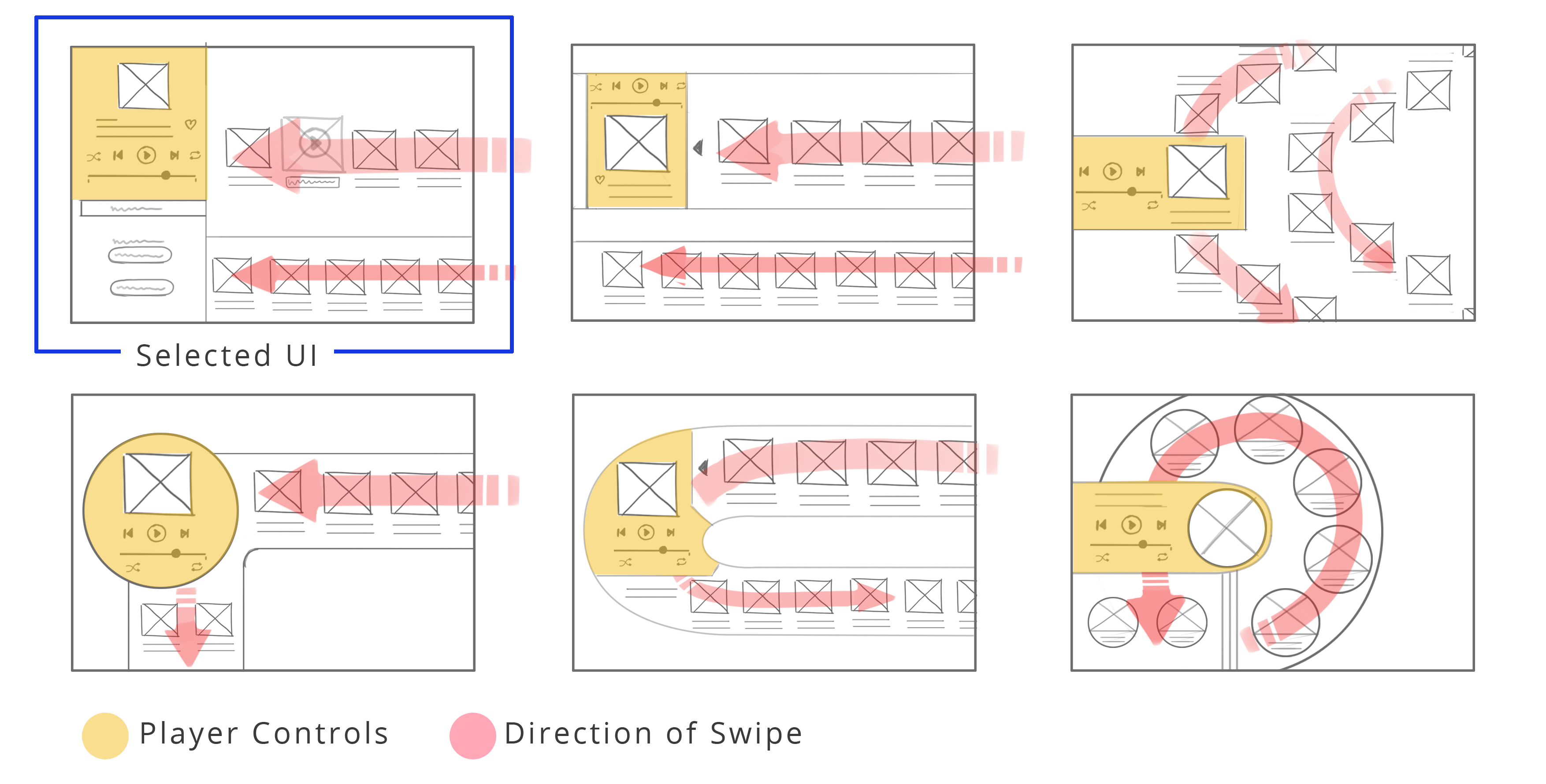
Wireframes & Rapid prototypes*
User testing was done at every level of wireframe development to ensure the issues were resolved. Several rapid wireframe prototypes with various layouts were created, as seen below.
Low fidelity
UI Prototype Explorations
For each of these explorations, the music player’s controls are positioned at a conveniently reachable ‘green zone - A’ (explained earlier), while different designs for the player’s outline are tried. Besides that, there is an emphasis on ease of use when arranging the music tracks in various patterns across different iterations. The primary objective was to declutter the interface by increasing the amount of white space.
Low fidelity
Selected UI Design
This chosen UI proposal's core principle is collapsibility. Except for the player controls and four music track information in the middle, the rest of the components may be minimised or hidden, eliminating visual clutter. (Further details of this UI’s operations and functions are explained in the high fidelity prototype section.)
High fidelity
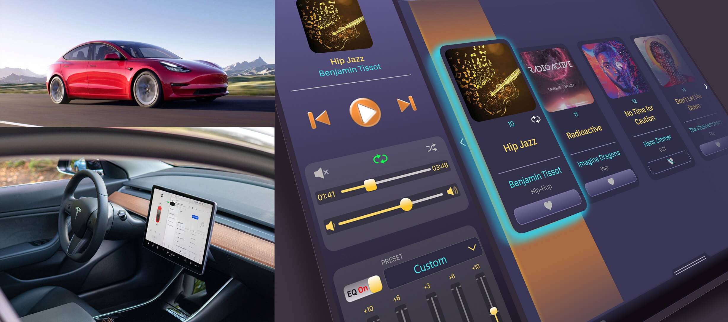
Final Design - Day Mode
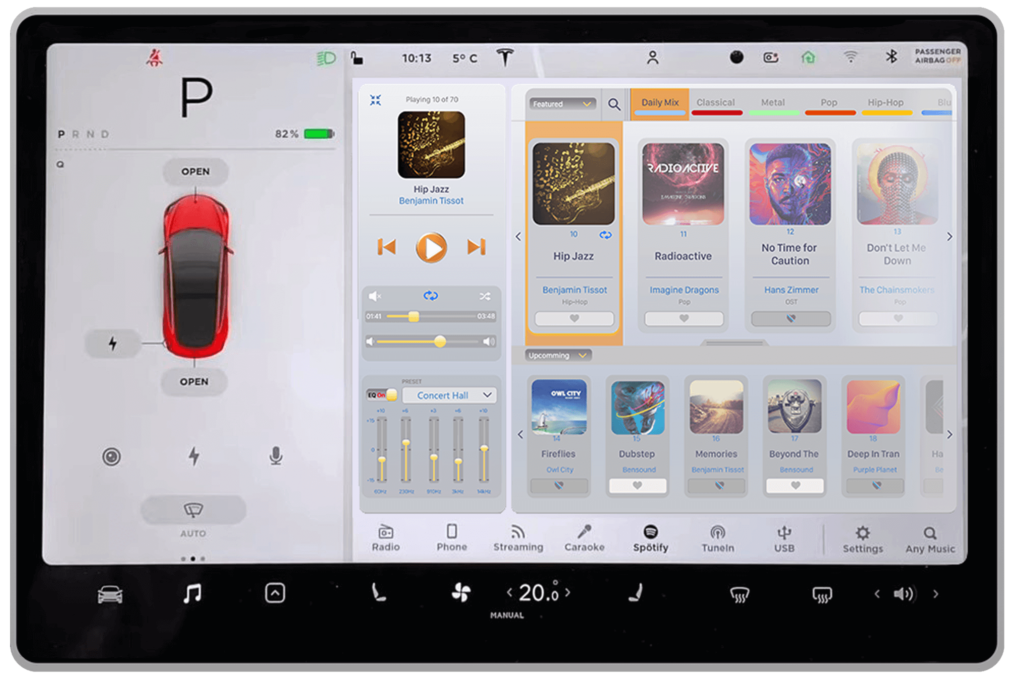
With a subtle colour palette that blends into the existing Tesla UI, this interface design of the music app ensures minimal distraction while daytime driving.
High fidelity
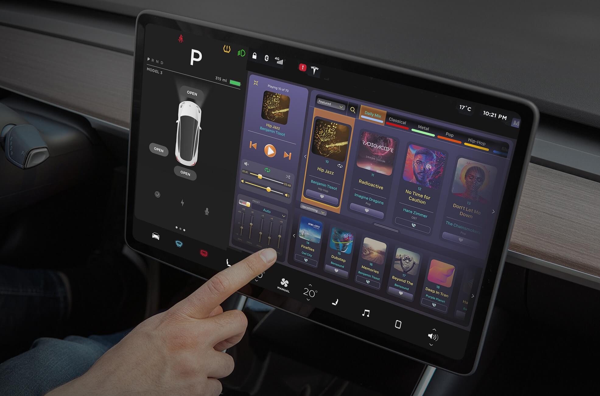
Final Design - Night Mode
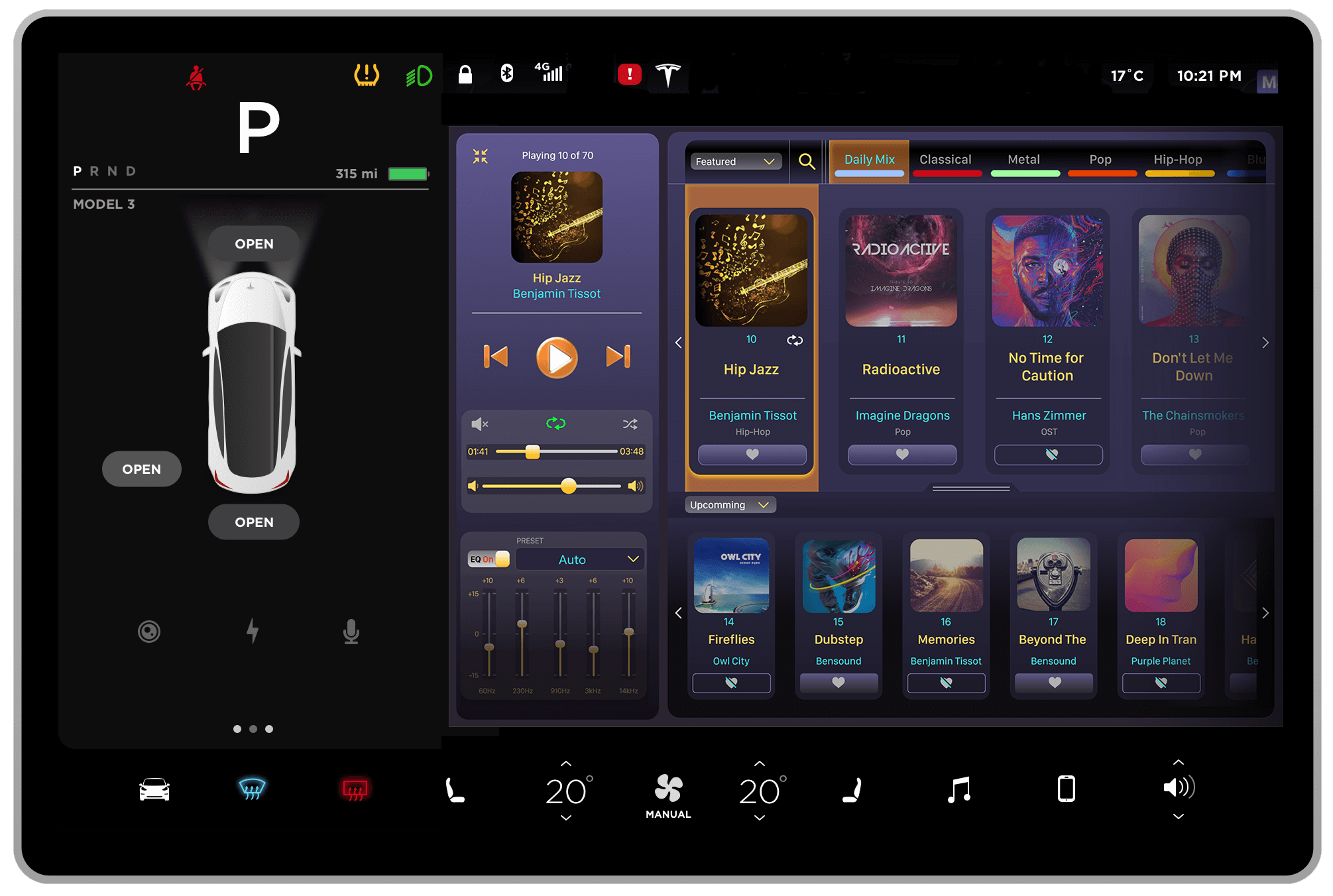
This app's night mode colours are what set it apart, while the colours used on a couple of the control buttons are carried over into the day mode UI as well. Important areas, including player controls, current track, next track, and music selection choices, have higher contrasts to reduce distraction.
App features and interaction
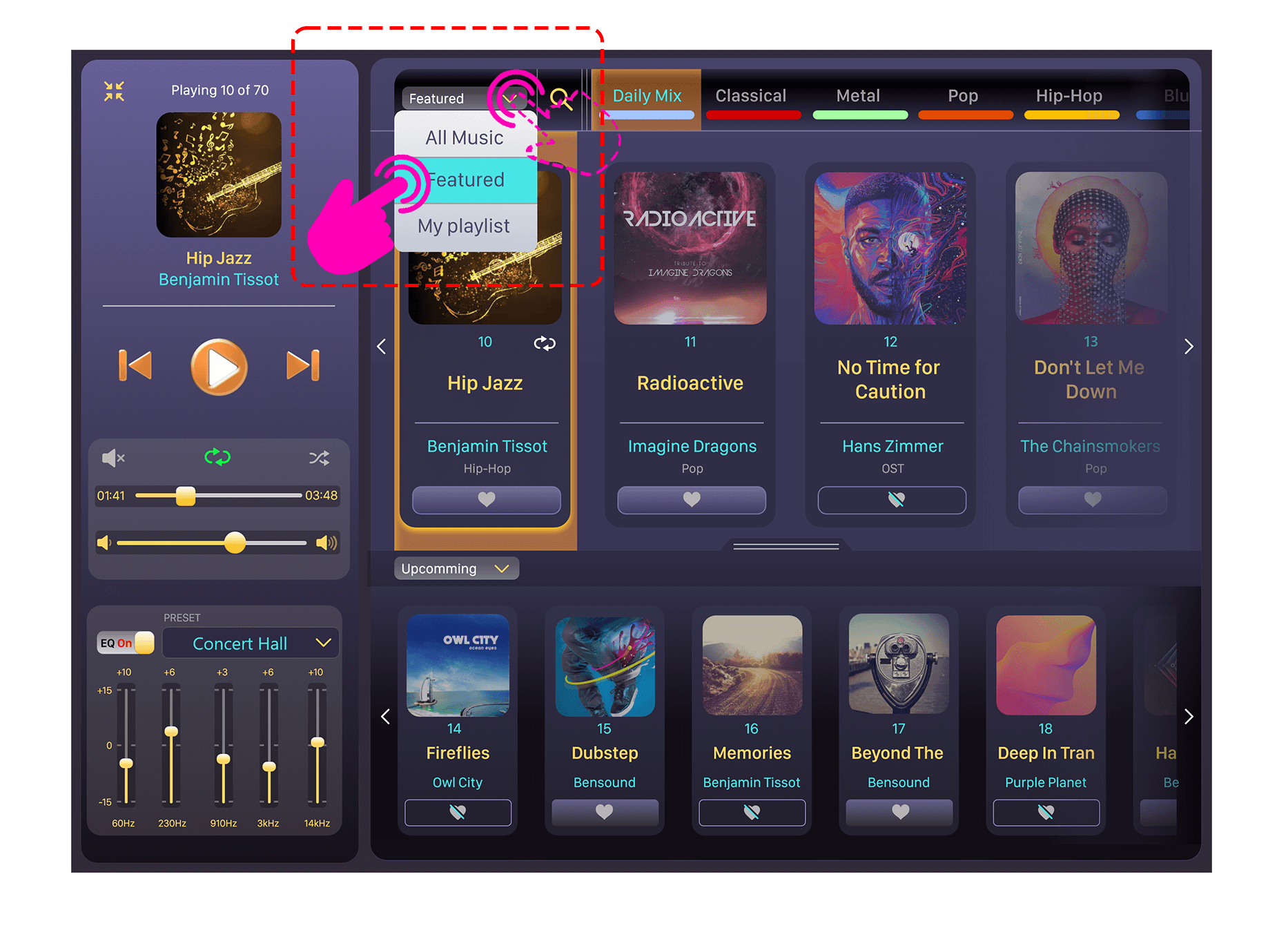
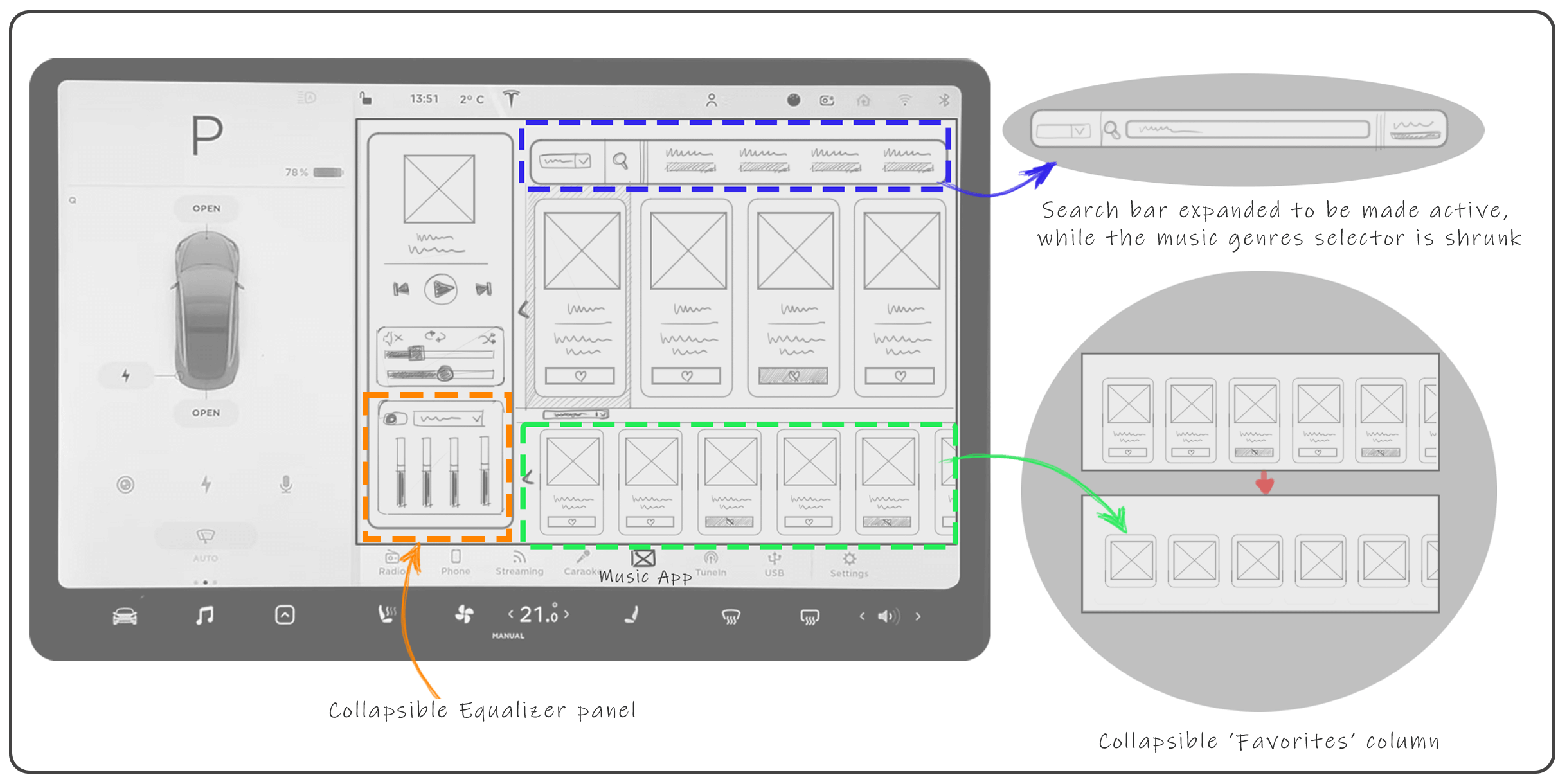
1. This drop-down menu shows options for ‘All Music’, ‘Featured’ and ‘My Playlist’. It populates music tracks/albums in the main list (upper panel).
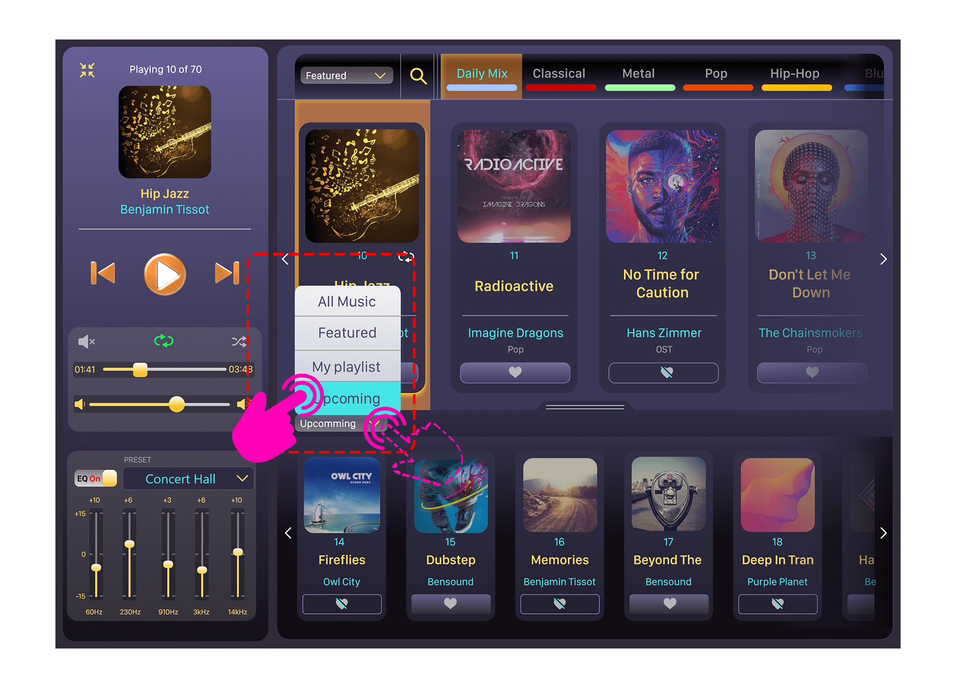
2. Lower section of the player populates the tracks/albums in with limited details and a smaller visual format than in comparison with the upper lists. A drop-down menu with options of ‘All Music’, ‘Featured’, ‘My Playlist’ and ‘Upcoming’ are provided as options to populate lower list (lower panel).
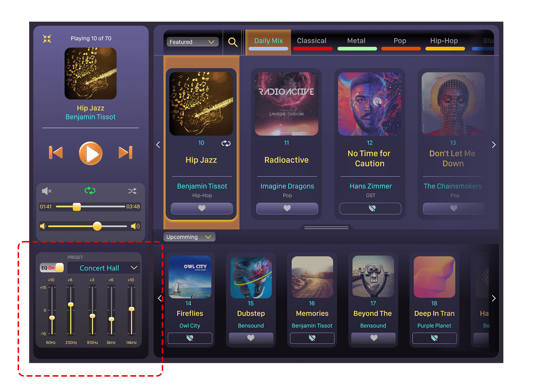
3. When the equalizer settings are active, it's panel is displayed with a higher contrast. In this state the different levels of the frequency can be easily distinguished.
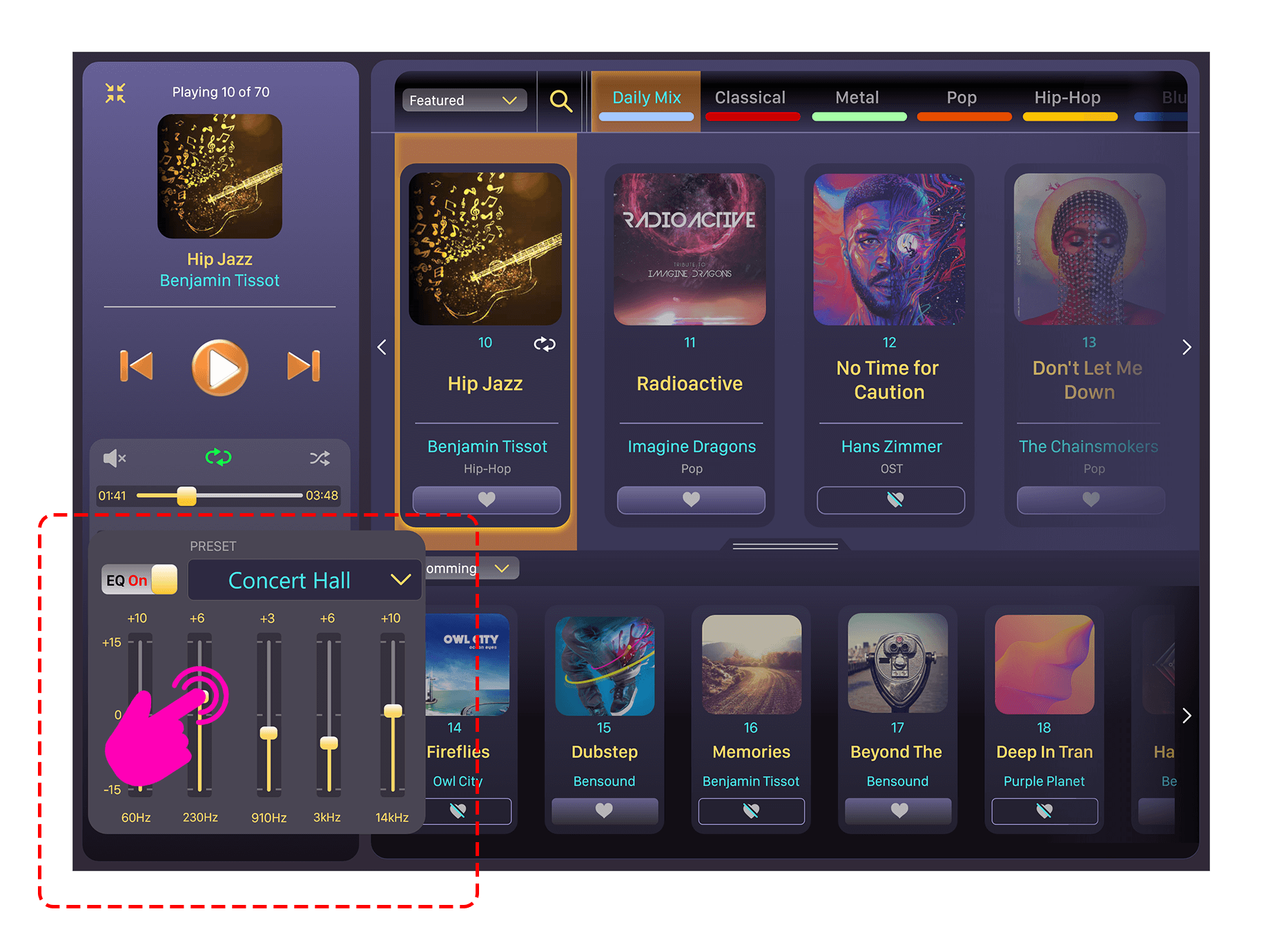
4. As soon as the user interacts with any of the frequency settings, the equalizer panel enlargers to make the details more legible for the user.
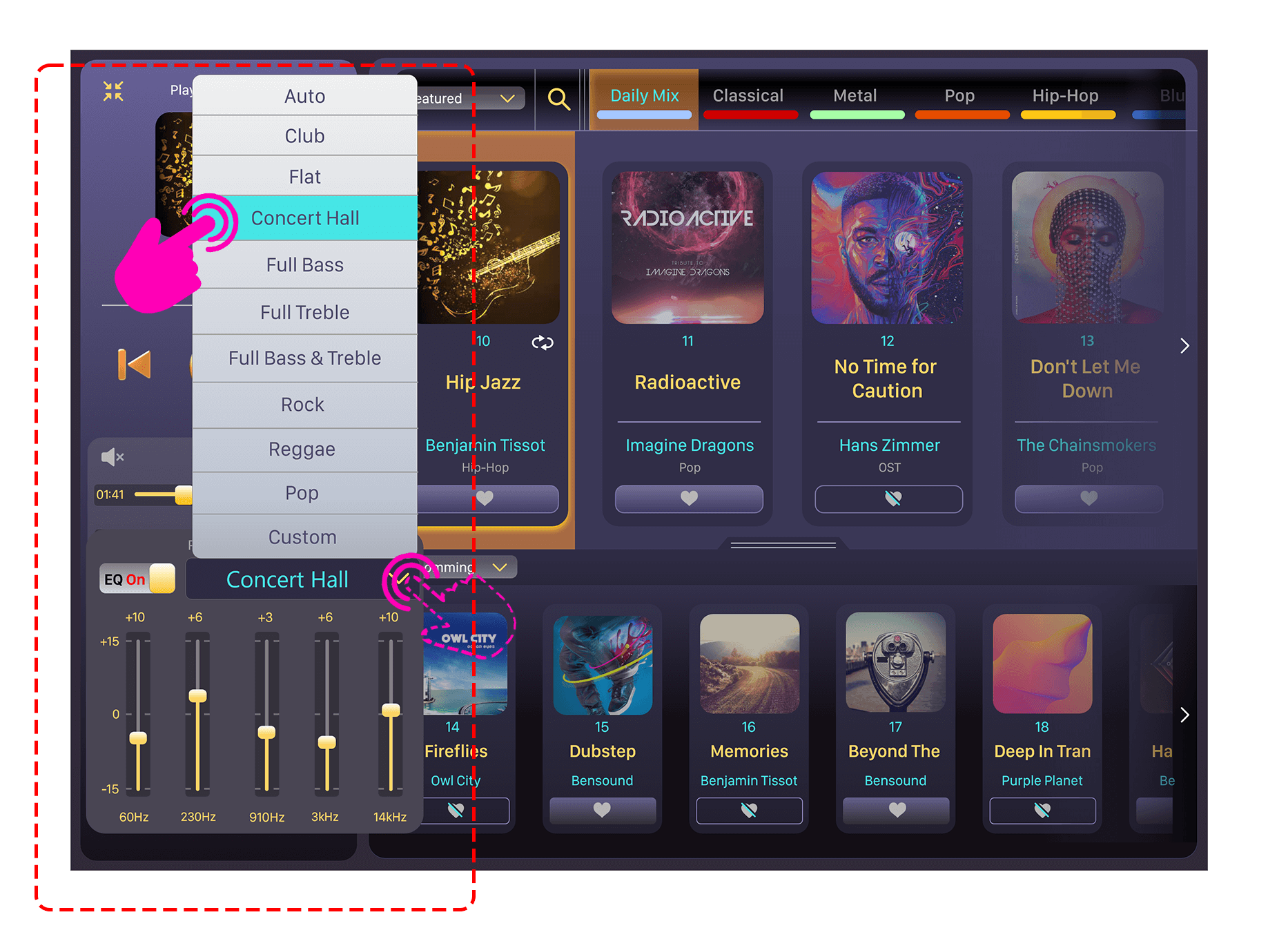
5. There are 10 presets and one custom option for the equalizer which could be selected by means of the drop-up menu. The equalizer panel remains enlarged for this operation as well.
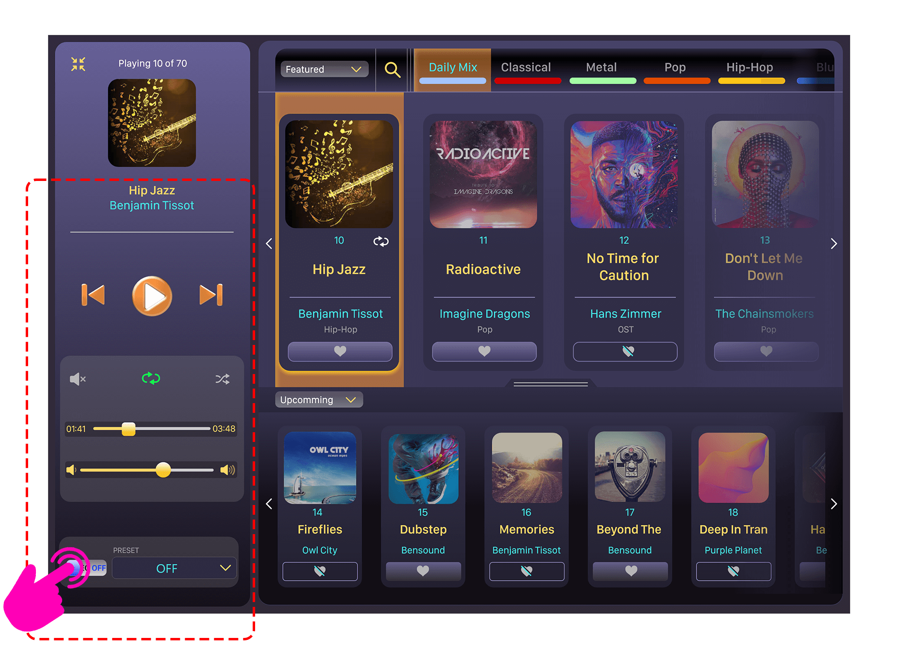
6. When the equalizer is turned off it collapses into a tray which is discreetly placed at lower bottom.
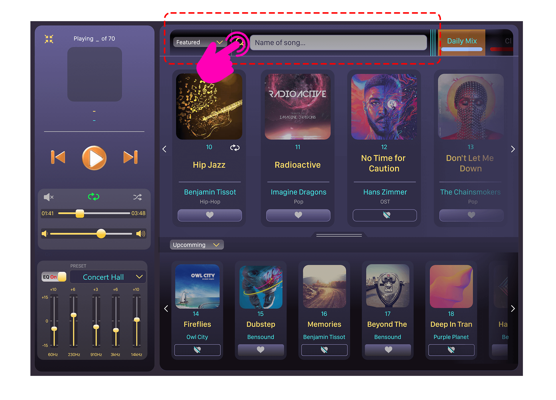
7. Whenever the user needs to search for a song/album they will have to first touch the search icon, which opens up a search bar. Necessary details can then be typed into this search bar.
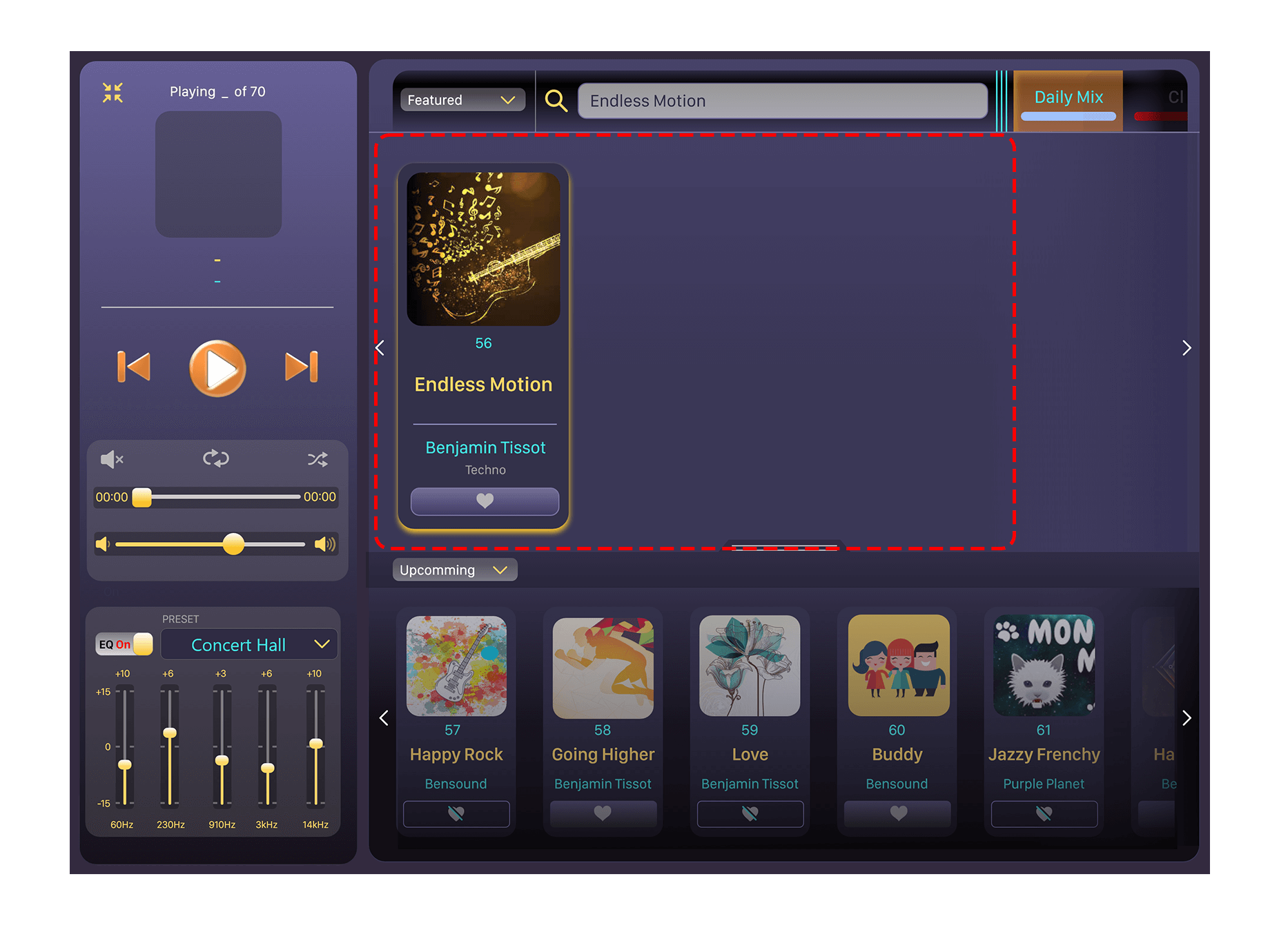
8. Depending on the search result, single or multiple tracks/albums would be displayed on the main list (upper panel).
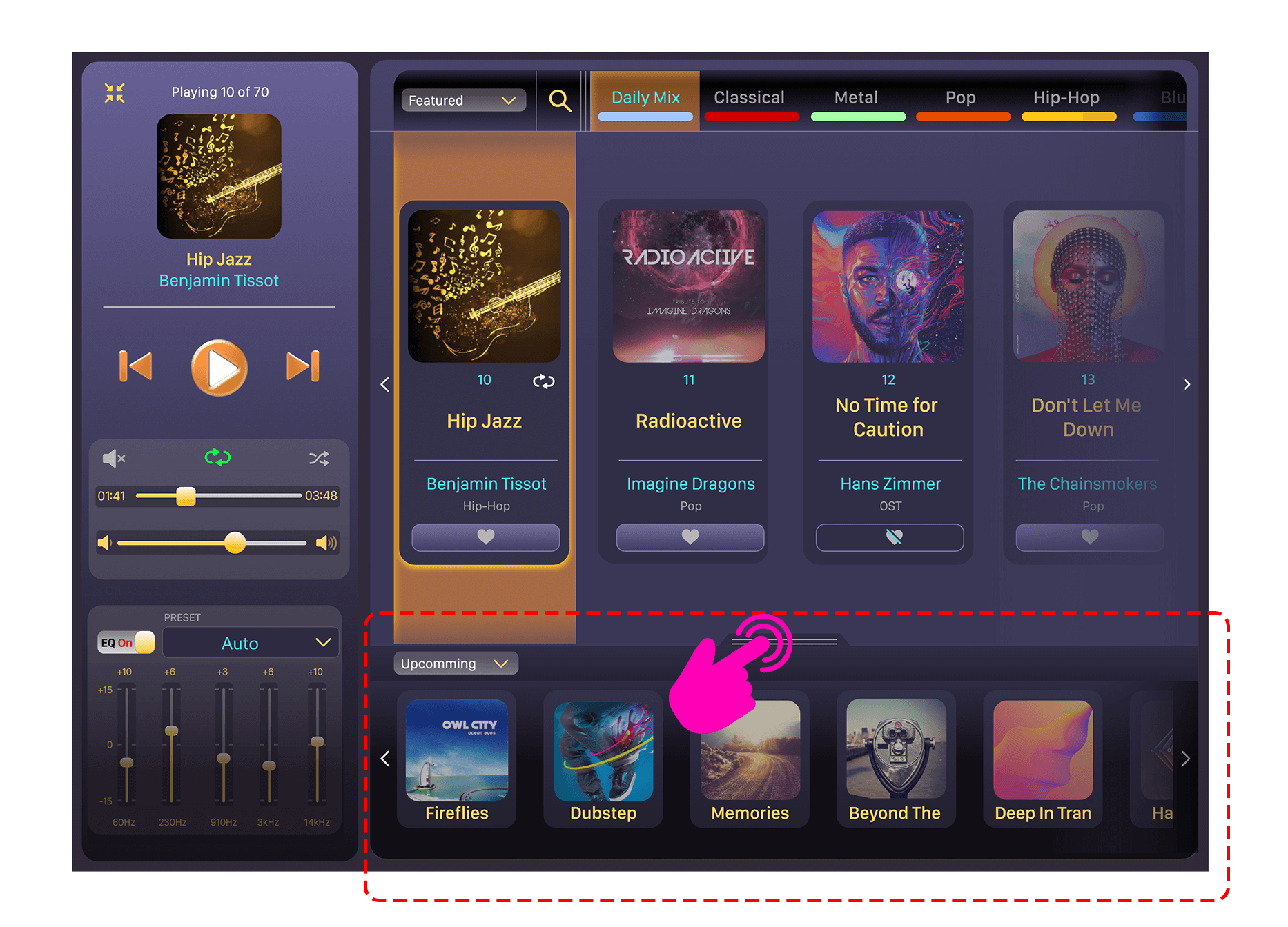
9. Stage 1 retract: Conceals the details of the lower list of tracks and shows just the album art and the track/album tile. Users can opt to this mode to minimise the information displayed.
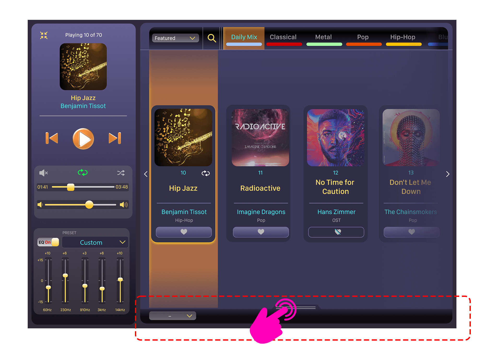
10. Stage 2 retract: This stage completely conceals the lower track list and is left with a bar to raise the lower panel. The main panel’s track/album list now covers most of the right section further reducing information.
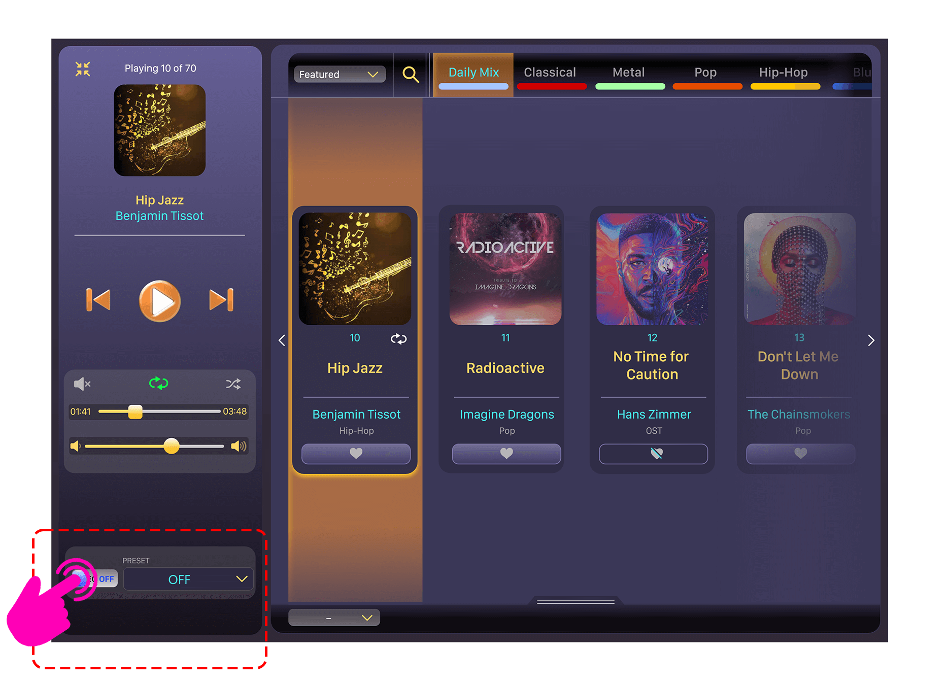
11. The interface here shows the equalizer turned off and the whole lower panel retracted.
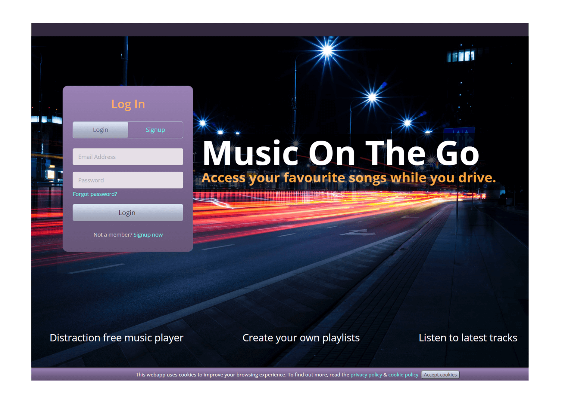
12. Sign in page of the music app visualized with the Starry sky (dark) theme.
Mini Mode
This mode reduces the app to its bare essentials, providing just the information necessary for music listening. Aside from that, the playback controls are oriented vertically for ease of access and a small footprint, freeing up room for other information to be shown underneath it. Tapping the search icon, on the other hand, launches a search window.
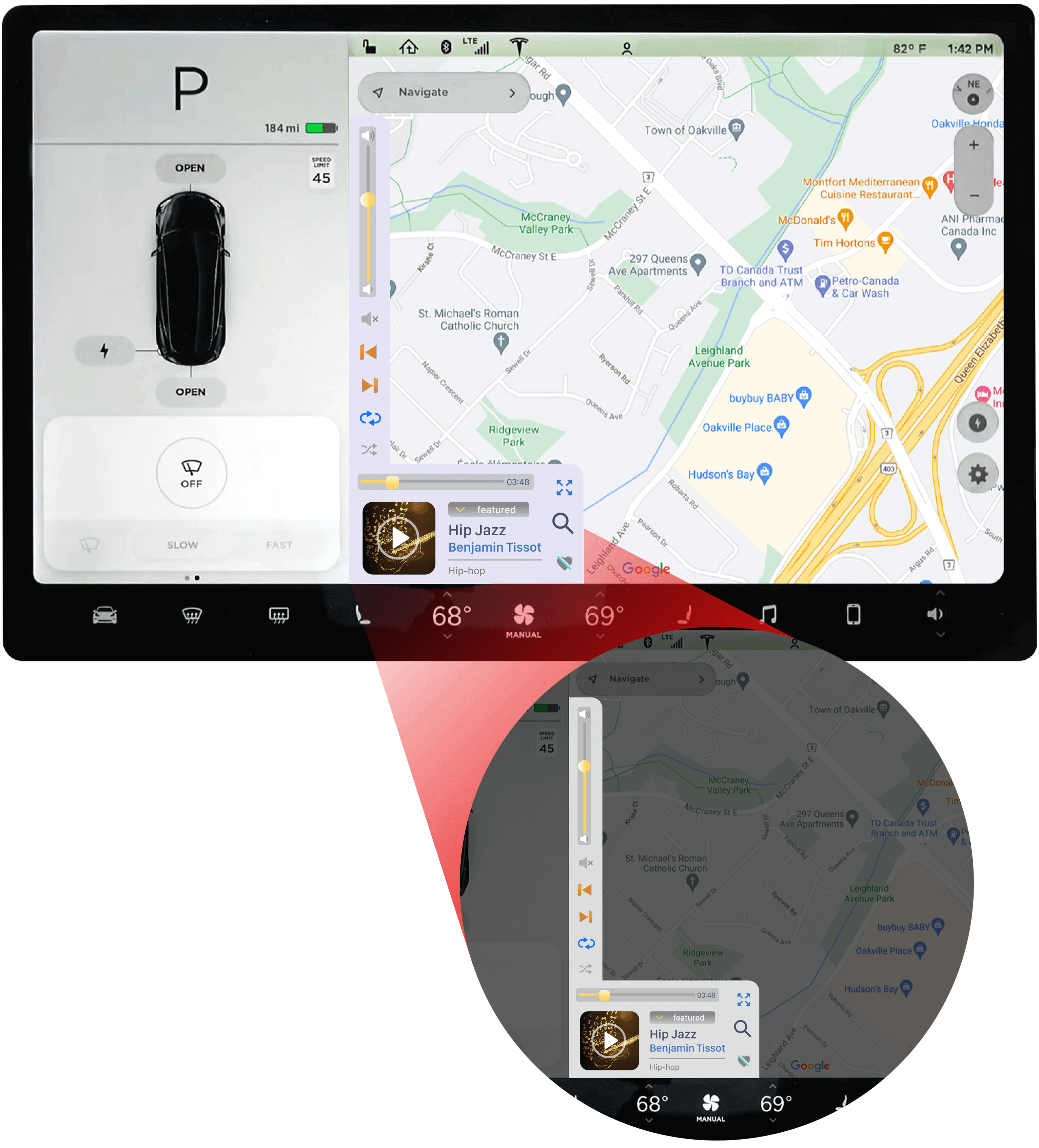
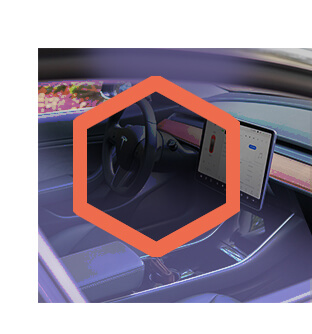
Car interior shown with ‘Music on the go’ app displayed
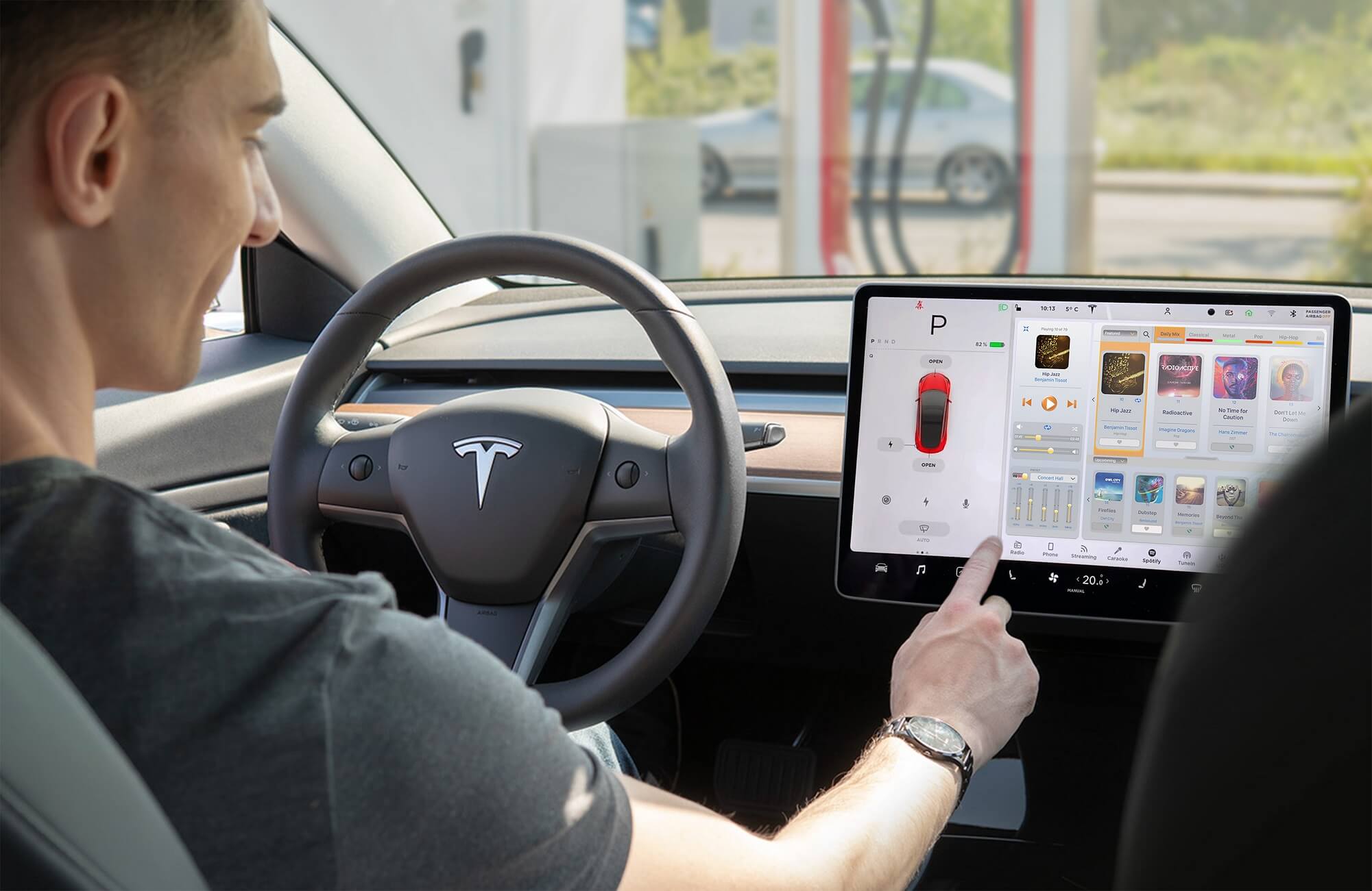
Light Mode
Dark Mode
Early Working App Demo
This prototype was created using HTML, CSS, JavaScript, and PHP. Although it lacks some of the final app's functionality, it offers a good overview of the key features. The app makes use of a music library and a user database built using PHP - MySQL.
Recommended screen-size & resolution: 15.6" screen size (Standard laptop screen size) with a resolution of 1920x1080 pixels. Certain elements will look distorted when using a larger screen size. This App is not designed to be responsive, so it will not display all elements below the recommended 15.6" screen sizes.
Operating instructions:
Log in: Use the auto-login or a personal login could be created by signing up. Playback: Tap/click on the album art of the required track. Search track: Type in a track name which is seen in the list. Additional feature added: Day-mode/Night-mode switching.
* Due to the complexity of this project and the tight timelines, few segments in the design of UI and UX were led completely by literature research. Also, the user research and testing were restricted in scope and most were performed remotely with a small sample of participants, leaving room for improvement in future product revisions.